Tl;dr
Sparing you the lengthy but excellent case study, here's what matters:
Outcomes
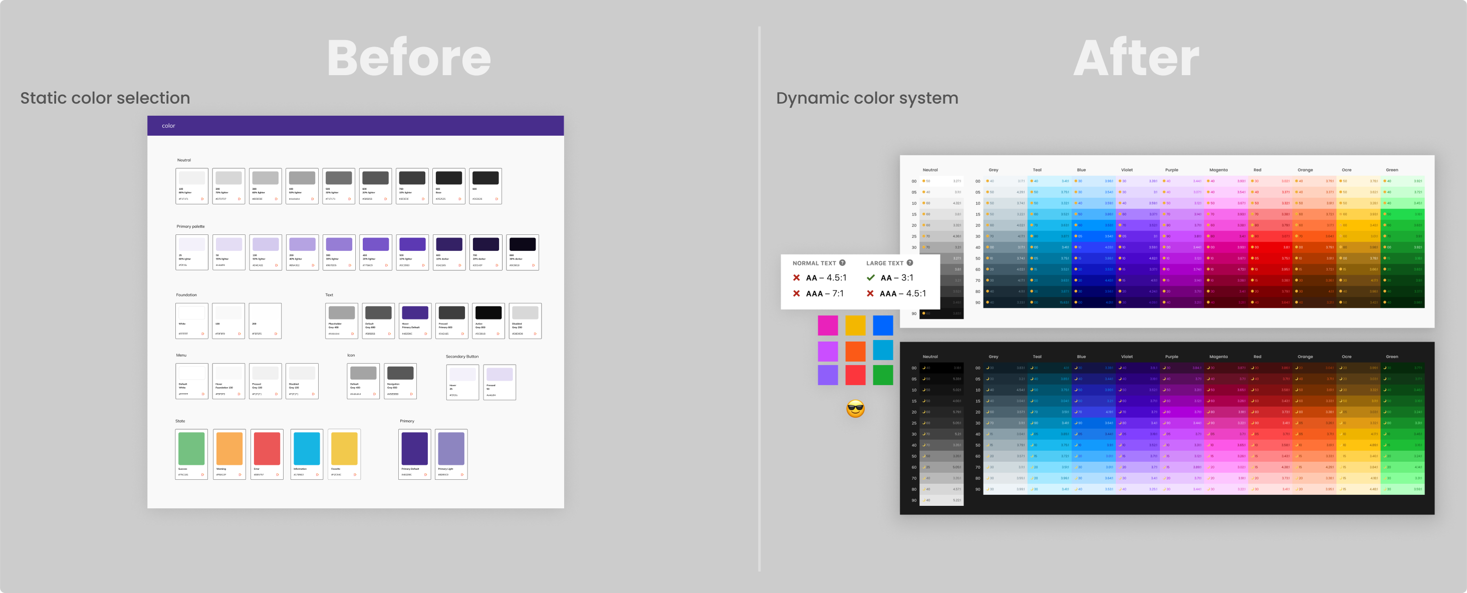
"The palette system" Is a color system and framework for styling UI at scale, which is the foundation of the Saguaro Design System at Trainual.
- Semi-automated flexible component styling
- 4x reduction in time spent in iniative design process 🔥
- Drastic reduction of styling bugs and defects
- WCAG contrast compliant ✅
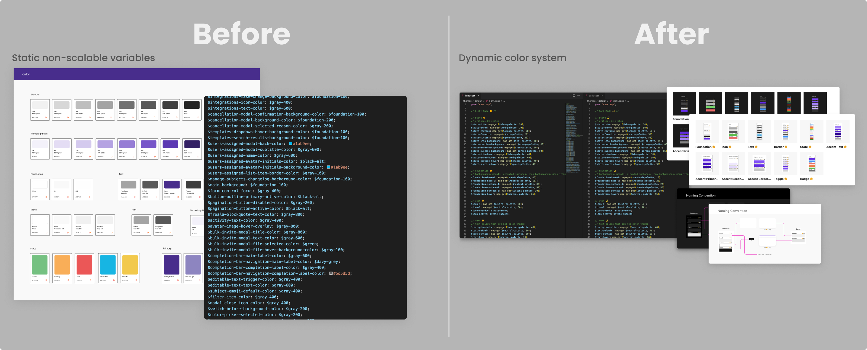
- Significant reduction of stylesheet variable tech debt
Before / After
Phase 1
Phase 2
Phase 3
Architecture flows
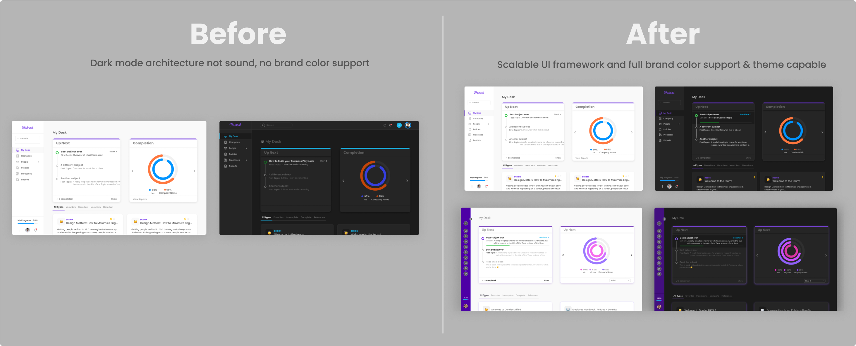
Flows“It’s already making converting designs to Dark mode 4x faster and 4x less brain power (you can use those data points in your case study)” - Tyler / Product Designer
Background
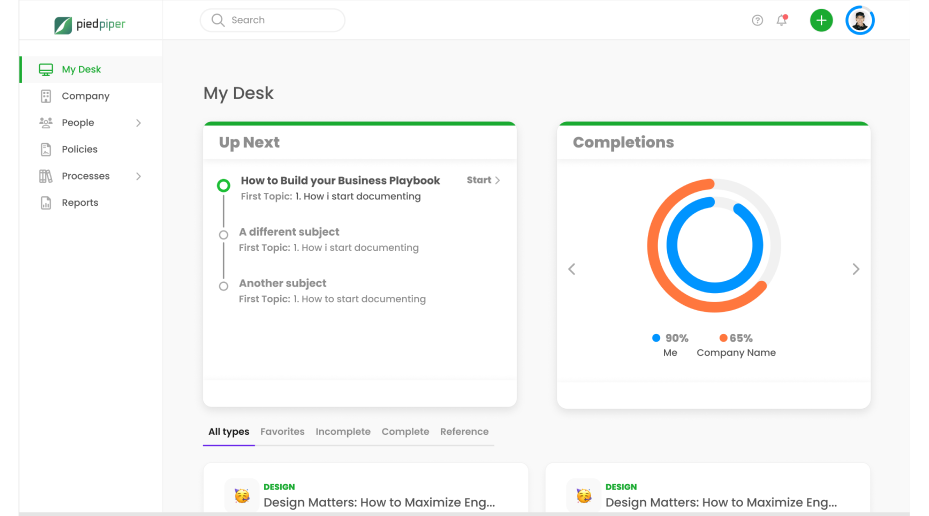
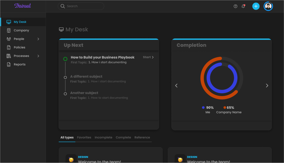
Heading into Q4 of 2020, I was tasked by my Director of Product with improving the look of our UI. Our squad was tackling a larger initiative at the time ( My Desk 2.0 ), and the plan was to use that initiative to start to introduce these changes.
Any designer worth their salt can tell you that you have to think about the wholistic picture of your product. You can dramatically change the look of one page or piece of the product, or you risk creating a disjointed, inconsistent user experience.
To design well at scale, you need systems, frameworks, processes, and guidelines that control the principles of visual communication; value, color, line, edge, & proportion. Unfortunately, our design system was barely established at this point.Before I was hired at Trainual, the team had contracted a designer to redesign the UI.
When I was brought on, I was to take over the project. It wasn’t a true component library, more similar to a stylesheet, so I had to re-architect everything, which was no easy feat. This was also before Figma had variants and was v1 of auto-layout.
All our efforts went towards componentizing and categorizing the products current reality. The first thing we needed was an easy to use component library in Figma so that we as designers could work efficiently and stay ahead of engineering. We had yet to even consider moving beyond what was just redesigned a few months ago.
A tall order
The palette system’s origin was originally born out of desire, but as I started the discovery process, I uncovered its absolute necessity. I uncovered several massive internal and external pain points which were detrimental to the business.
It affected the entire Product, Design, & Engineering organization's ability to hit business goals & solve customer problems as fast as possible. It was an imperative problem to solve.I knew that this ask would be a monumental effort, but I don’t think any of us at the time knew just how large it would end up being.
Problem space
Problem 1: Visual language
The first problem was the catalyst for the deep rabbit hole I ended up in. As a Product & Design team, we wanted to be able to improve the styling & visual language of the application. Our application looked ‘okay’ but was not a cutting-edge design by any measure.
We only had a handful of colors, most of which were used for accessibility styling. We needed a broader range of colors to work with to be able to be creative, as well as be scalable into the future.
But we were in a severe color constraint; Our product has to support custom brand styles.
Problem 2: Custom brand styles
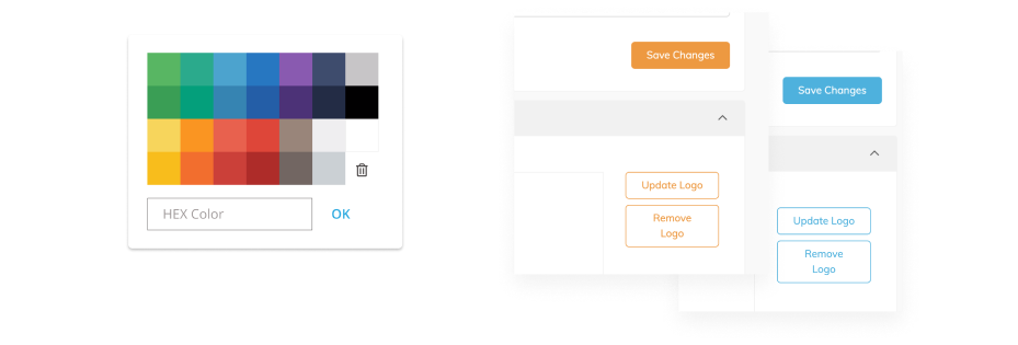
Part of Trainual’s early value proposition was custom branding or white-labeling of the Product, and a decent amount of customers still get value from it. This allowed customers to set a custom hex color to match their company’s brand color along with uploading a custom logo.
This custom color is used throughout the app to add style and consistency on everything from buttons and toggles, to links and navigation. We were essentially crippled design-wise with one of the most impactful visual elements.
As a design team, using color as a design element wasn’t possible without likely clashing with a users custom brand color, not to mention accessibility concerns.
Problem 3: Accessibility
Because of how brand styles were implemented in the application, it was an accessibility nightmare.
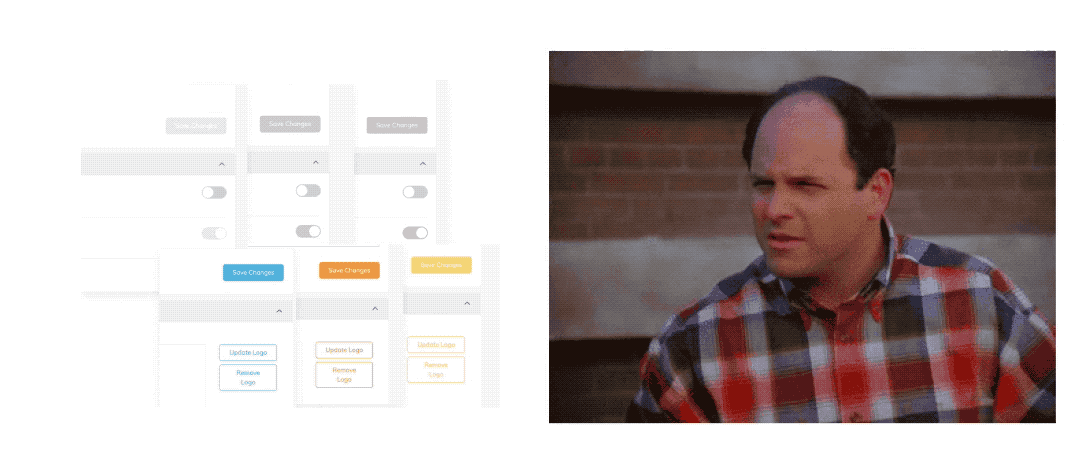
The custom hex input meant users could pick any retina-burning color they wanted. Additionally, 40% of the default color picker choices didn’t come close to passing any WCAG contrast standards.
Problem 4: Dark mode
Another team released Dark Mode just a few months after we had been hired . It was a quick and dirty project which was architected poorly on top of legacy code, which was made worse by the UI redesign project. Additionally, custom brand styles did not work in dark mode.
Research
I started with the most important problem to solve; color. Regardless of what colors we used or whether we had total control over the usage in the UI or not, we needed a color system.
Color systems
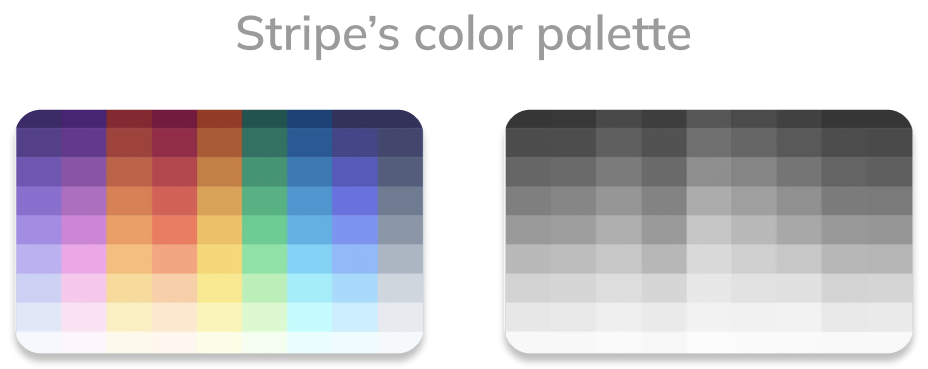
To start, I referenced color systems I had built before, which were based off Stripe’s accessible color system as a model for the approach.
Additionally, Stripe had a very similar constraint to ours; The colors used in the product interface are based on brand colors. In Stripe’s case, it’s their own company’s brand colors; In our case, it’s our customers.
Stripe created an internal system and interface to visualize and manipulate color using perceptually uniform color models. This gives them exacting precision over hue, value, contrast, & chroma.
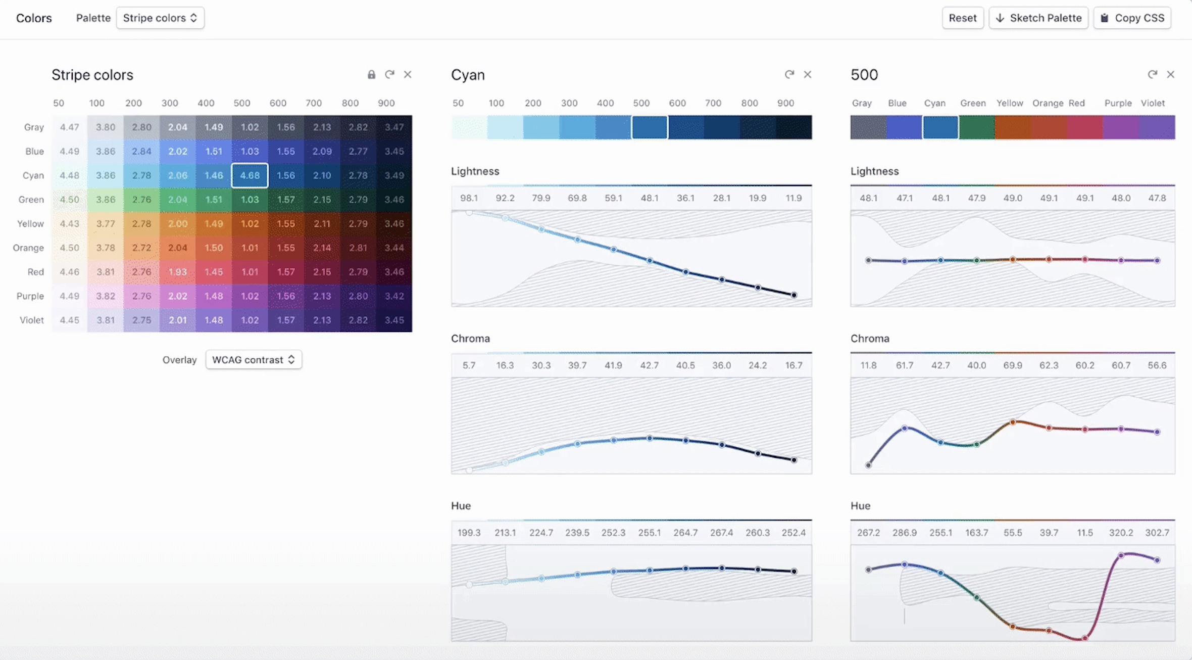
To better understand what all that means, I’ll reference the excellent breakdown in the Stripe article on color space;
Color space 101
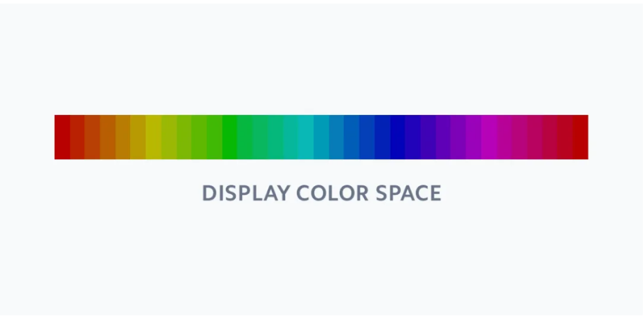
"We're used to working with color on screens regarding the RGB color space. Colors are specified regarding how much red, green, and blue light is mixed on screen to make the color.
Unfortunately, while describing colors this way comes naturally to computers, it doesn't come naturally to humans. Given an RGB color value, what needs to be changed to make it lighter? More colorful? Add more yellow?
It's more intuitive for us to think of colors as organized by three attributes:
- Hue: What color is it?
- Chroma: How colorful is it?
- Lightness: How bright is it?
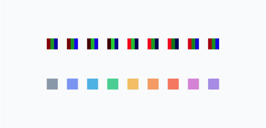
A popular color space that supports specifying colors in this way is HSL. It's well supported in design tools and popular code libraries for color manipulation. There's just one problem: the way HSL calculates lightness is flawed. What most color spaces don't consider is that different hues are inherently perceived as different levels of lightness by the human eye—at the same level of mathematical lightness, yellow appears lighter than blue.
The image below is a set of colors with the same lightness and saturation in a display color space. While the color space claims the saturation and lightness are all the same, our eyes disagree. Notice that some of these colors appear lighter or more saturated than others. For example, the blues appear especially dark and the yellows and greens appear especially light.
There are color spaces which try to model human perception of color. Perceptually uniform color spaces model colors based on factors that relate more to human vision, and perform sophisticated color transformations to make sure that these dimensions reflect how human vision works.
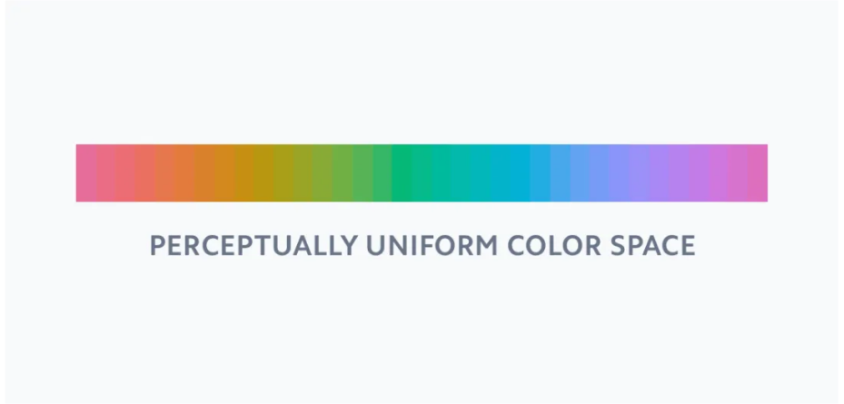
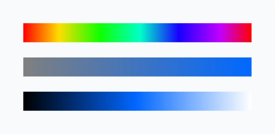
When we take a sample of colors with the same lightness and saturation in a perceptually uniform color space, we can observe a significant difference. These colors appear to blend together, and each color appears to be just as light and as saturated as the rest. This is perceptual uniformity at work.
There are surprisingly few tools that support perceptually uniform color models, and none that came close to helping us design a color palette. So we built our own. "
There are three key problems this model solves:
- Predictable accessibility: Colors have enough contrast to pass accessibility guidelines.
- Clear, vibrant hues: Users can easily distinguish colors from one another.
- Consistent visual weight: At each level, no single color appears to take priority over another. Every color appears perceptually the same.
Unfortunately, the tool is internal, but that didn’t mean creating something similar was impossible.
When developing my first color system early in my career, I realized that my understanding of ‘perceptually uniform color space’ was intuitive; I was unaware I already knew it inside and out.
Traditional color spaces
I spent years studying and understanding color as a fine artist. The first two years, while I focused exclusively on drawing with charcoal, I practiced color charts. The purpose of color charts is to learn to master your palette. mixing pigment, and learning to control it within a stepped value scale.
Each chart has a dominating primary color that you then mix with every other color in your palette. In this example below, the chart is for Cadmium Yellow Light. The first row of the chart is pure Cad. Yellow Light plus white. Each column after is Cad. Yellow Light + another color + white.
The top row is absent of any white, so the strength of the mixture is 100%, the darkest the mixture can be. The bottom row is mixed with as much white as possible while still allowing the base color to show (maybe 5 or 10%). Each row is then balanced in even percentages, so the middle row would be 50% between your lightest light and darkest dark.
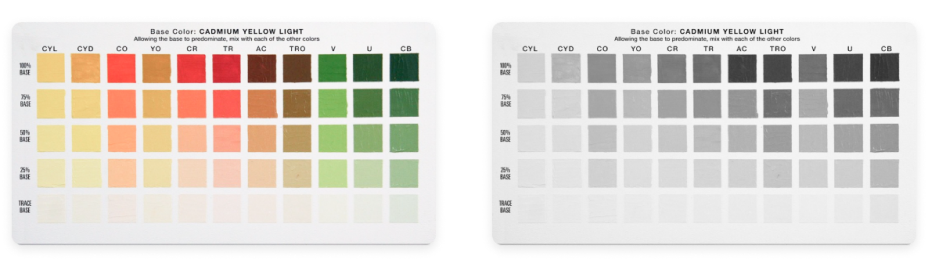
The goal is to make each row have the same visual weight regarding value and saturation, aka perceptually uniform color modeling.
Design
I wanted to create a well-rounded set of hues that covered the entire color spectrum similar to Stripe’s.
From a color range perspective Stripe’s selection was perfect. The problem with using Stripe’s color palette out of the box was that the hues were too muted for our use case.
Creating the palettes
I needed a way to play with the saturation and value ranges holistically, and that's when I remembered that I had Kevyn Arnott's tool colorbox.io booked marked.
With Colorbox, I could adjust hue, saturation, and brightness along a stepped value scale to create unique color palettes.
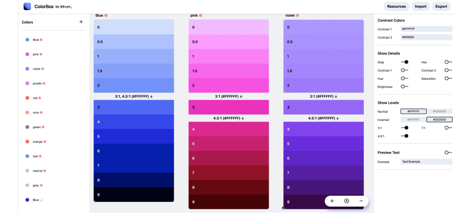
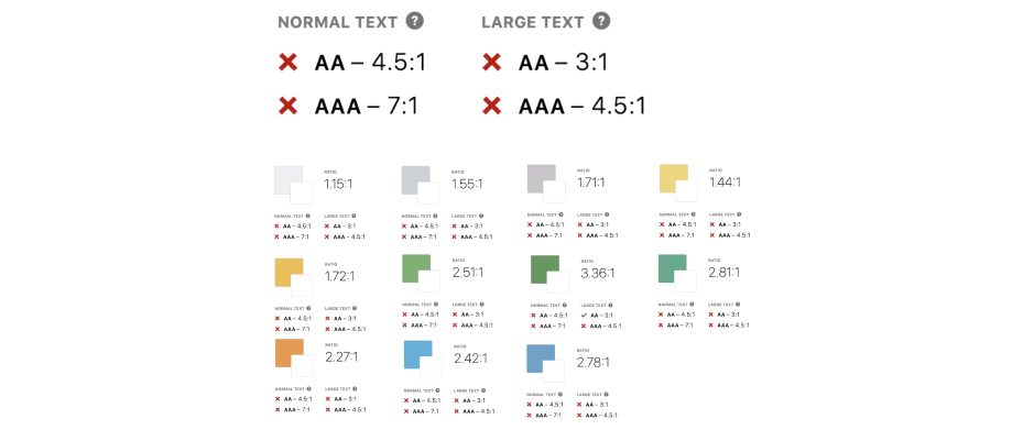
Knowing that colors are at their most vibrant in the middle of the color spectrum, I kept the AAA contrast ratio of each palette around step 3 & 4; making sure that the most vibrant colors sat in the middle of the scale meant that it would also work seamlessly in dark mode.
Colorbox offers a lot of control, but not enough for what I wanted. The steps from 0 - 2 were indistinguishable for certain palettes because of the color curves used to optimize vibrancy. I knew I would have to manually adjust the rest. I pulled the Colorbox palettes into Figma so i could tweak the palettes further.
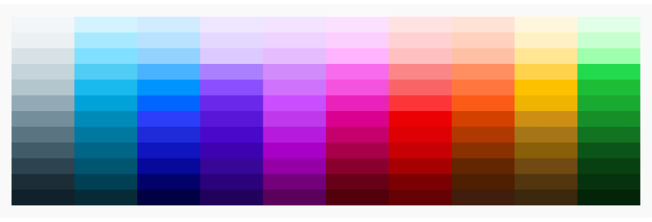
Color in action
To make the palettes as flexible as possible, I needed to create value groupings for different use cases and affordance types. This helps reinforce the gestalt law of similarity; reinforcing the subconscious link between form and function.
I reduced contrast between 3-4 adjacent values. Each group had a scoped intended use and covered the range of anything we could need.
.png)
I balanced all the values and saturation for each palette by eye to make sure as best as I could that there weren’t any hues that were overpowered across rows.
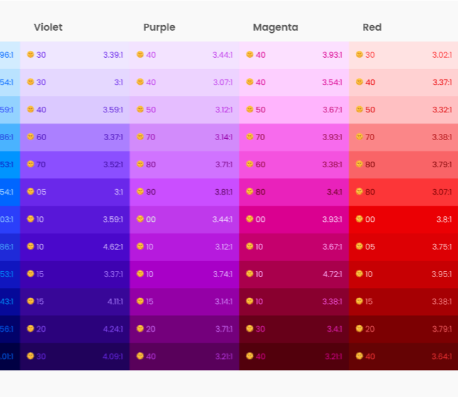
We needed to make sure our secondary buttons and links would have plenty of contrast. I documented the minimum AA large text contrast ratios on each color using the handy the stark plugin.
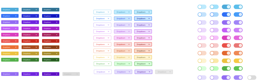
From there I styled all affordances making sure they were aesthetically pleasing, met contrast standards, and carried the same visual weight across palettes.
We had a flexible, scalable, accessible color palette and freshly styled components. Now it was time to start introducing it to code.
Ship it?
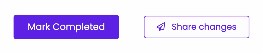
I wanted to start with buttons. We had primary and secondary buttons that had the same hover state. From a design perspective, it didn’t make a lot of sense. Affordances should be distinctive in structure and interaction.
I asked our engineering director Zach at the time to see if he could tweak it. It’s just a hover state, how long could that take?
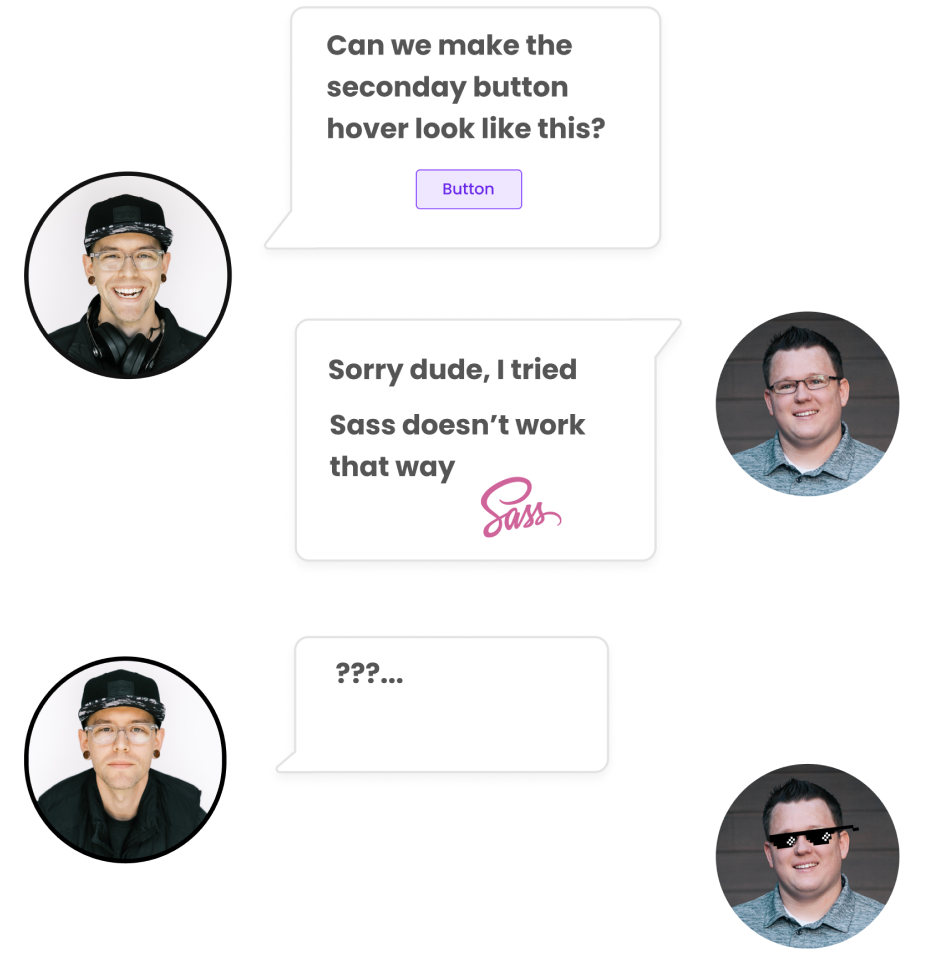
Turns out, it can take a long time. We had a major technical blocker in code with our stylesheet variables. I was aware of what SaSS was as a front-end language ( it's hard to avoid if you know even a little bit about CSS ) but had never worked with it.
So of course I had to go down that SaSS rabbit hole to figure out if what we wanted to build was possible.