

Tl;dr
Sparing you the lengthy but excellent case study, here's what matters:
Outcomes
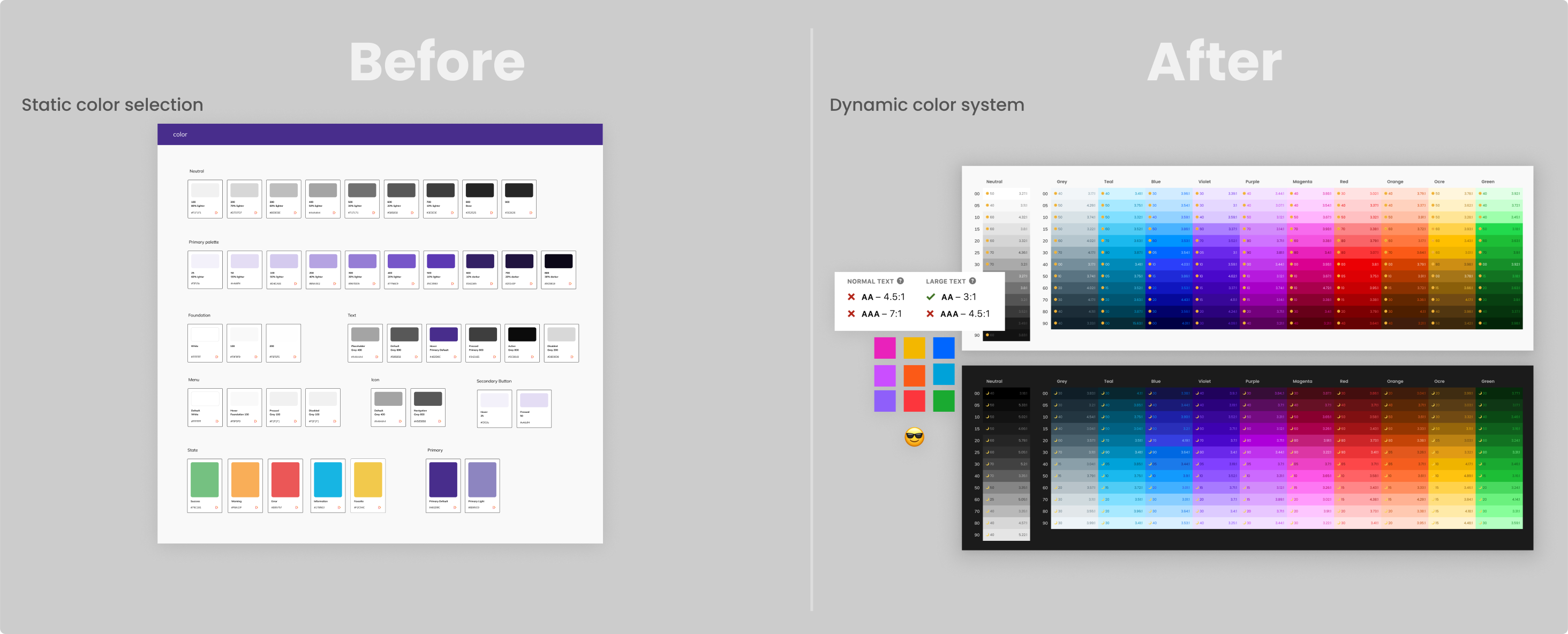
"The palette system" Is a color system and framework for styling UI at scale, which is the foundation of the Saguaro Design System at Trainual.
- Semi-automated flexible component styling
- 4x reduction in time spent in iniative design process 🔥
- Drastic reduction of styling bugs and defects
- WCAG contrast compliant ✅
- Significant reduction of stylesheet variable tech debt
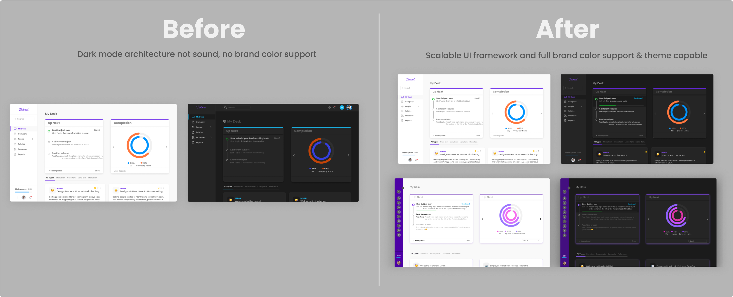
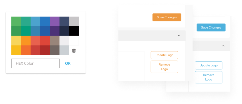
Before / After
Phase 1
Phase 2
Phase 3
Architecture flows
Flows
Research
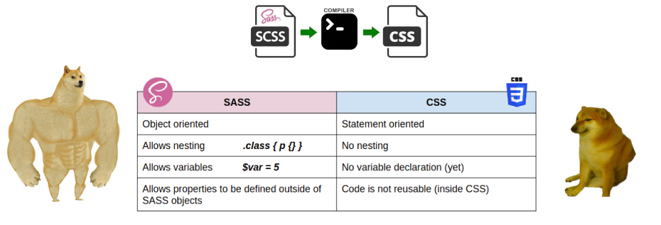
So, we left off finding out that the nice new buttons I designed can’t be built because of something to do with SasS. It was time to figure out why. I started reading up on the basics of SasS.
Color functions
One of the cooler features of SasS is the color functions; which lets you manipulate and generate color in a sorts of ways. It also happens to be the source of our pain; the lighten and darken functions.
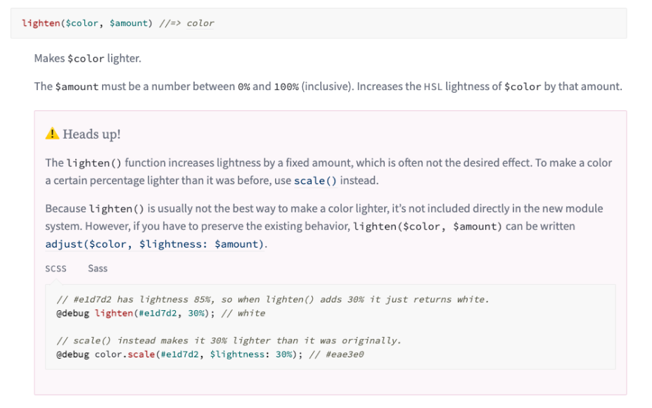
The product was set up to take a base color that the user selects to style the application’s affordances; buttons, toggles, links, etc.
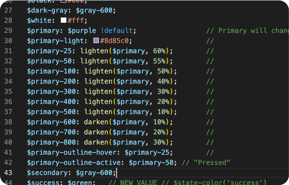
It then uses the lighten/darken function to generate hover & pressed states from that base color using a static percentage.
This is why the hover state on secondary and primary buttons is the same. The variable on line 41 referencing line 31, which uses the lighten function.
Method madness
The entire front-end stylesheet library was built on this lighten/darken method and was tightly linked together. While this can work on a smaller, simpler scale, it’s this method that is the source of the accessibility nightmare.
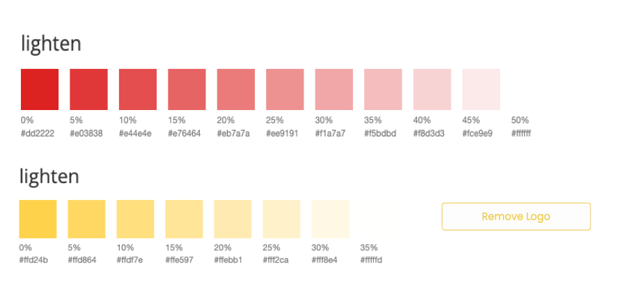
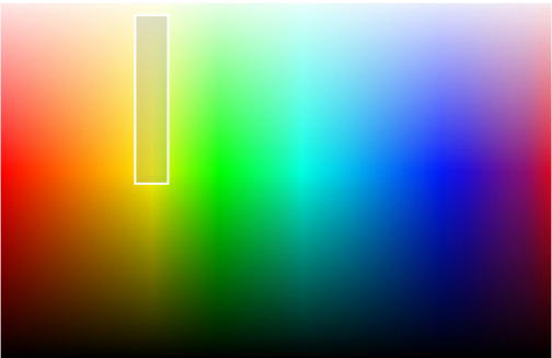
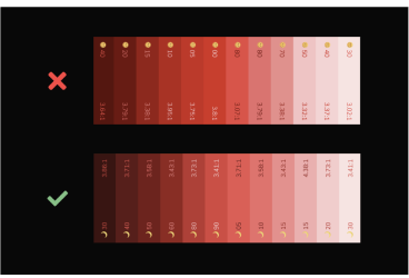
Because of the nature of color and how computers interpret it, you simply can’t use a static percentage to generate consistent color interactions. Using the sass color generator, you can see what I mean.
I wanted to create a secondary button that had a light background fill. Based on the method we used, the background color would have to be lightened around 45/50%. This might look great on a decent amount of color selections.
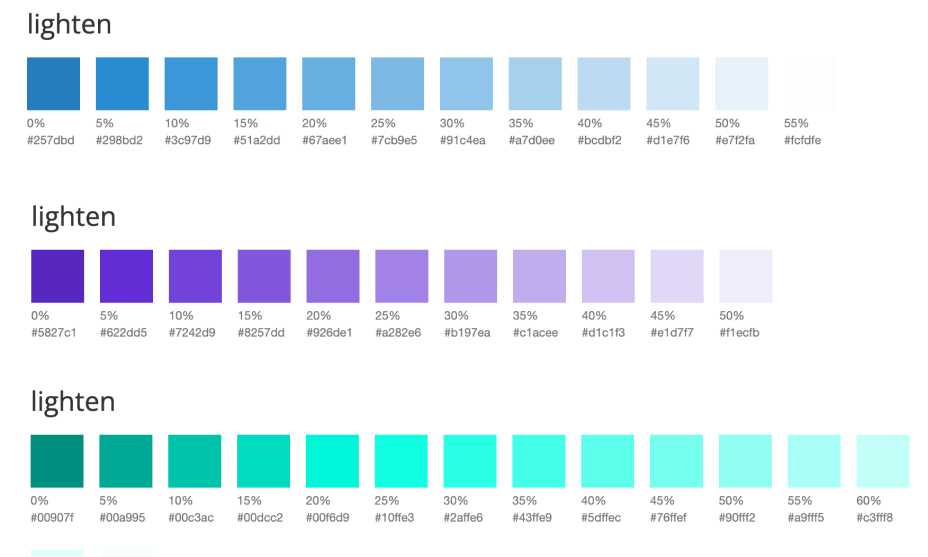
But on colors with a lighter overall hue range, the background fill is completely lost. This would create some really odd and inconsistent UX.
Not good
Turns out my engineering director wasn’t wrong. Creating a secondary button with a light color fill wasn’t possible because of the limiting nature of percentage-based color generation mixed with the very dynamic nature of color.
Looking at the color spectrum below, this means that for this method to not break across the entire spectrum, the base color must be below the white line. That’s a pretty limited & unappealing range of colors to choose from.
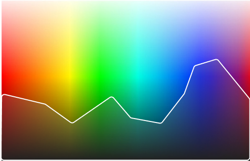
This was not good. This functionality left the company exposed to the very real possibility of an accessibility lawsuit. The only way to fix it while enabling better component styling in the current method is to only allow our customers to use some of the worst brand colors imaginable. These dark colors also wouldn’t translate to dark mode. Not great options on the table.
Can it be done?
This nasty problem effected the entire business; from the customers ability to use the product, down to an engineers ability to write code. We needed to scrap it all and start over. Was there a way out of this? I had to know.
What I knew so far about SasS was that it was beyond powerful, so I was determined to figure out a method in SasS that would solve our ever-growing list of pain points and deliver on what I envisioned for a color system.
To understand the architecture envisioned for the system and what I was trying to create, we first need to touch on semantic naming.
Semantic naming is a big part of writing scalable code, and avoiding duplicate class names when dealing with color and legacy code can be it’s own special kind of hell.
Semantics 101
Semantic class naming is a method of choosing class names that describe what an element is, or it’s intended purpose, rather than how it looks.
The goal is to create naming conventions that are useful and flexible as possible while keeping the complexity to a minimum.
HTML is a great example of basic semantics. Instead of using generic divs with specific class names, using HTML5 built-in tags creates an understandable and usable hierarchy, not only for the developer, but the end user who may use a screen reader or keyboard accessibility.
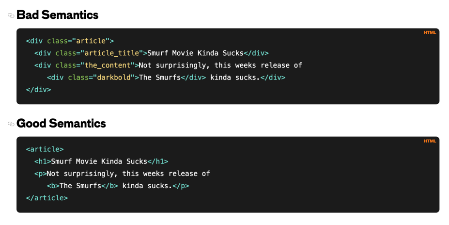
Unfortunately, our problem cannot be solved using simple HTML5 tags. We’re on our own.
Color semantics
Semantic color naming conventions can be all over the place depending on the industry or use case; look no further than interior paint, or Crayola crayons. My inspiration for naming conventions was on the other side of the craft store; oil paint. I thought about how artists and paint manufacturers approach natural pigments.
Most of the time the name is consistent across brands, based on chemical and organic compounds, like Cadmium Orange. This scientific approach makes it easy to navigate the plethora of choices among brands offered to artists.

Palette naming
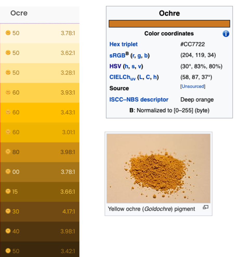
Regarding naming each color hue range, most of the names are quite common and easily understood. The one hue range that differs most from what people would expect is what represents ‘yellow.’ What most people think of as ‘yellow’ exists only in a very narrow range of the color spectrum.
We needed a different name that better represents the entire spectrum; A more wholistic name is Ochre. Ochre, or ocher in American English, is a natural clay earth pigment, a mixture of ferric oxide and varying amounts of clay and sand. When mixed with white, includes ranges close to what we call ‘yellow’.
It’s often called Yellow Ochre or Gold Ochre in oil paint. I simplified it to just Ocre.
With the color palette created, named, and tested on affordances, I turned my attention to the larger architecture of the UI.
Form 101
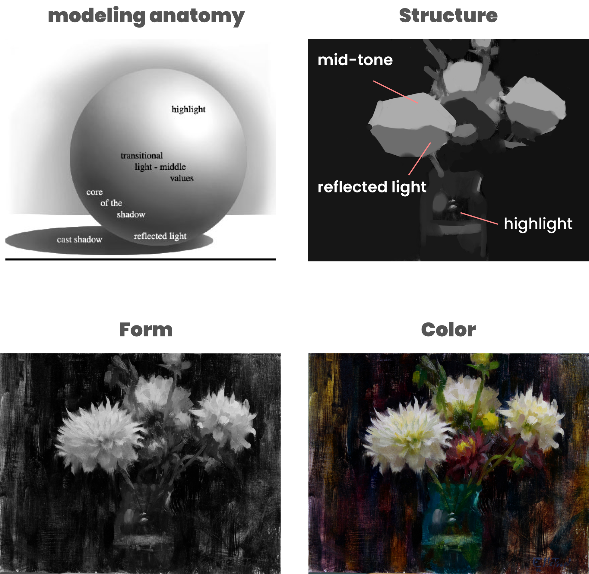
When working on a painting, I’m constantly thinking about the bigger picture; the impact and overall impression of the composition. This matters more than the tiny details. By focusing on form and value, you can create a faithful representation of anything; color then becomes a secondary concern.
We needed a semantic naming set and framework that would help us think about and define the structure of the UI similar to how I think about it mentally when painting.
We would also need to factor in and account for individual elements. Each element needs to be definable and distinctive enough to differentiate it self from other elements, while still belonging to a group.
This is the type of layered architecture I envisioned; core color > extrapolated color palette > application-specific color mixtures > applied to UI. This level of abstraction would give us enough control and flexibility to change values for anything with ease.
Implementation
Taking the leap
This was a huge problem we needed to solve, and explaining the breadth of the system simply was challenging enough. There were only one or two engineers who were familiar enough with the front-end to ramp up and figure it out, but that would take time and resources we didn’t have.
We were moving at hyper speed within the Product org; each team juggling 3-4 initiatives at a time in a true Lean UX fashion. This was great for getting features and fixes out to customers quickly, but not so great for the necessarily slow, methodical, exploratory nature of architecture work. Slow and exploratory doesn’t work well with sprint points, so it was something that needed to be worked on outside the normal Agile framework.
It was an un-winnable battle to get resources for bandwidth from engineering for anything related to front-end architecture or systems at the time.
Instead of relinquishing myself to defeat, I saw an opportunity to sharpen my code knowledge. A lot of this stuff in code was outside my wheelhouse at the time, but I was preparing to do all the heavy lifting to guarantee that it gets built.
Architecting systems takes time and sometimes leads you down dead-ends; It’s a giant leap into the unknown. This was at the tail-end of Q4 2020, and the holidays get quiet with everyone usually taking several weeks of time off, so this was the perfect time to GSD.

Architecture
A few weeks later, after lots of trial, error, QA testing, and a bout with covid, I emerged victorious and a SasS expert to boot.
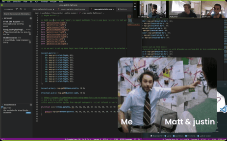
At this point I wasn’t very familiar with environments or our Git repository, so I built it in isolation. I pulled in my Engineering lead Matt, who was a workflow and architect wizard in code, to run through what I came up with to make sure it could be done.
Unleashing the full power of SasS
SasS is a powerful CSS pre-processor. A pre-processor lets you do a lot of things you might want to do in Javascript, like using functions, variables, and arrays, which aren’t available in CSS. I’ll break down all the awesome functionality that powers the system as we look at each piece.
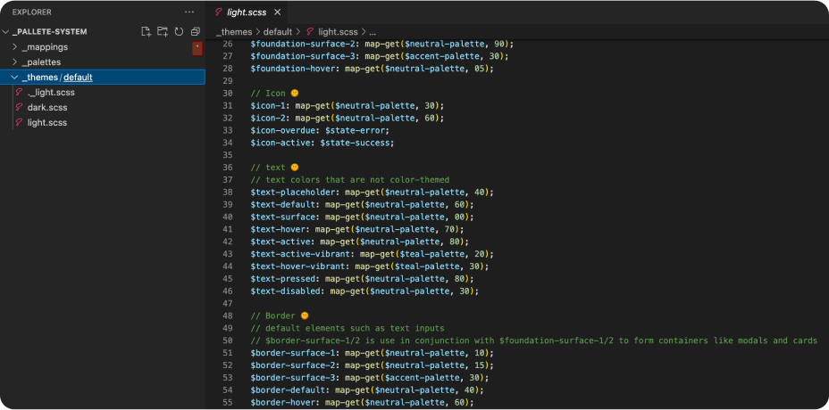
SasS Maps
This core functionality is part of the elegance that makes the system easy to use and understand. Maps give flexibility within the core of the color palettes that scales all the way up to the UI page level.
Maps use nested key, value pairs which you can easily reference individually. New nested values can be added easily, avoiding the need for a brand new variable.
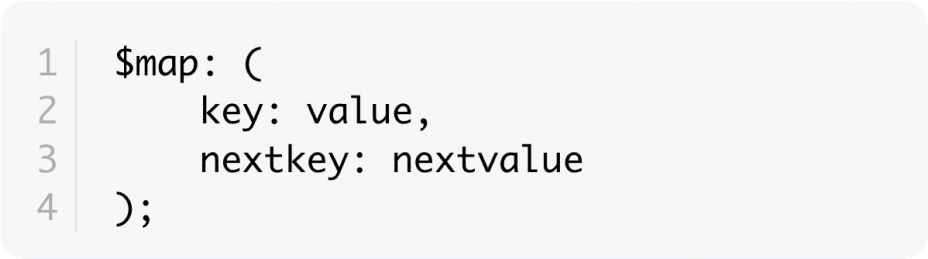
Let’s take a look at how Maps were used on the core color palettes
Color palettes
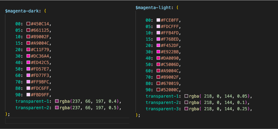
The architecture of the core color palettes is simple.11 hue ranges that cover the entire color spectrum. Each hue is then broken into a 12-step value contrast scale from 0 to 100.
The neutral hue range is reserved for structuring the UI. (e.g. text, borders, and shadows.) It has one extra step for pure white and pure black.
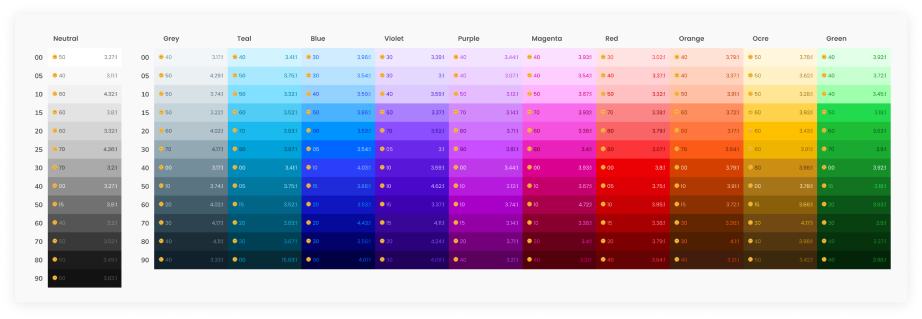
Each jump in the scale represents a roughly even increment in value across all hues, with 1/2-steps near the base value of the scale for predictable color contrast and greater nuanced control.
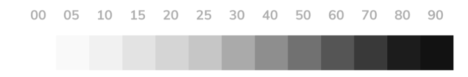
Zero represents the value closest to the base display modes value (white or black). So, if i needed a light blue in light mode, i would use Blue 00 or Blue 05.
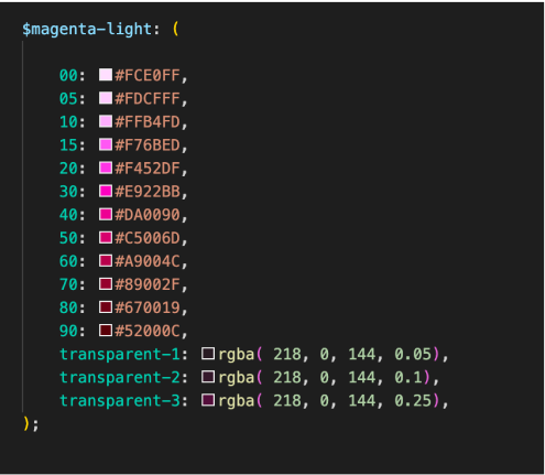
Here’s how the core palettes were structured in SasS.
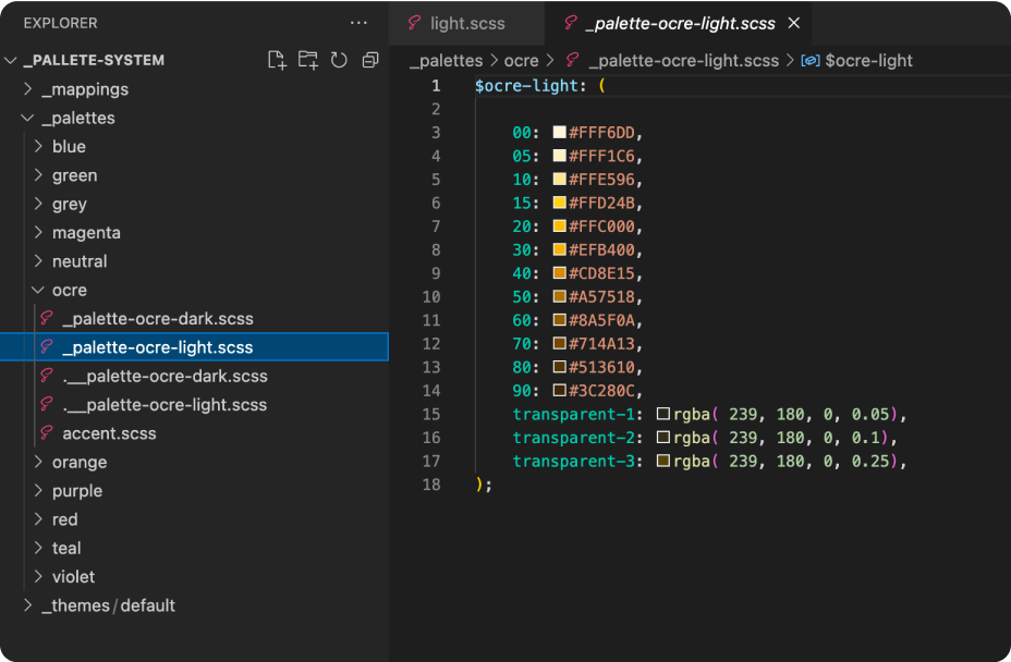
_Partials
Partials are crucial to the file organization of the system. This makes the system modular and maintainable. Here you can see that each palette is its own partial file.
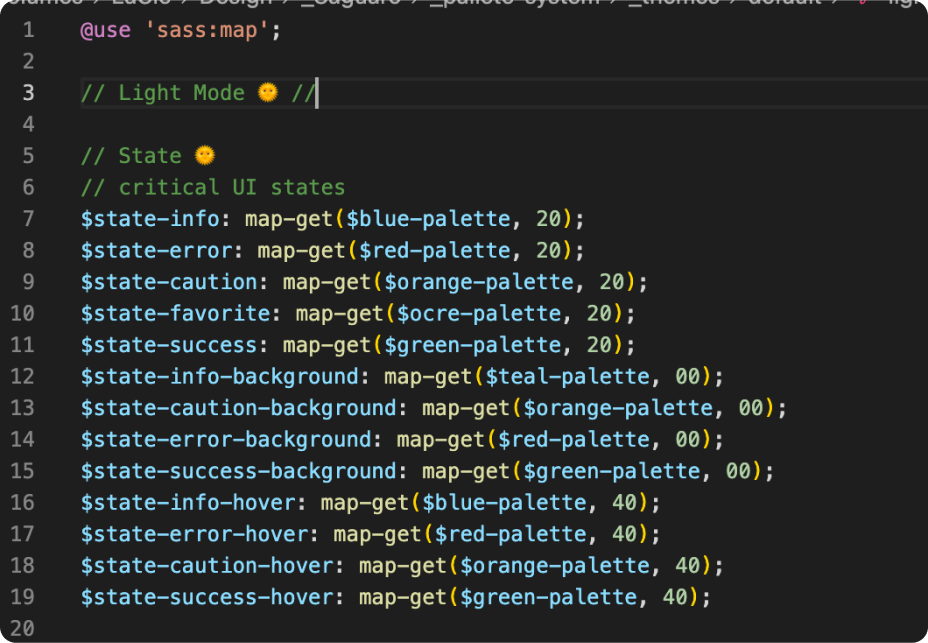
@Modules
Modules are how you can access and use the variables in your partial files in other files using the @use rule. Instead of including every color from every palette, we can reference only the colors we need and reduce build times.
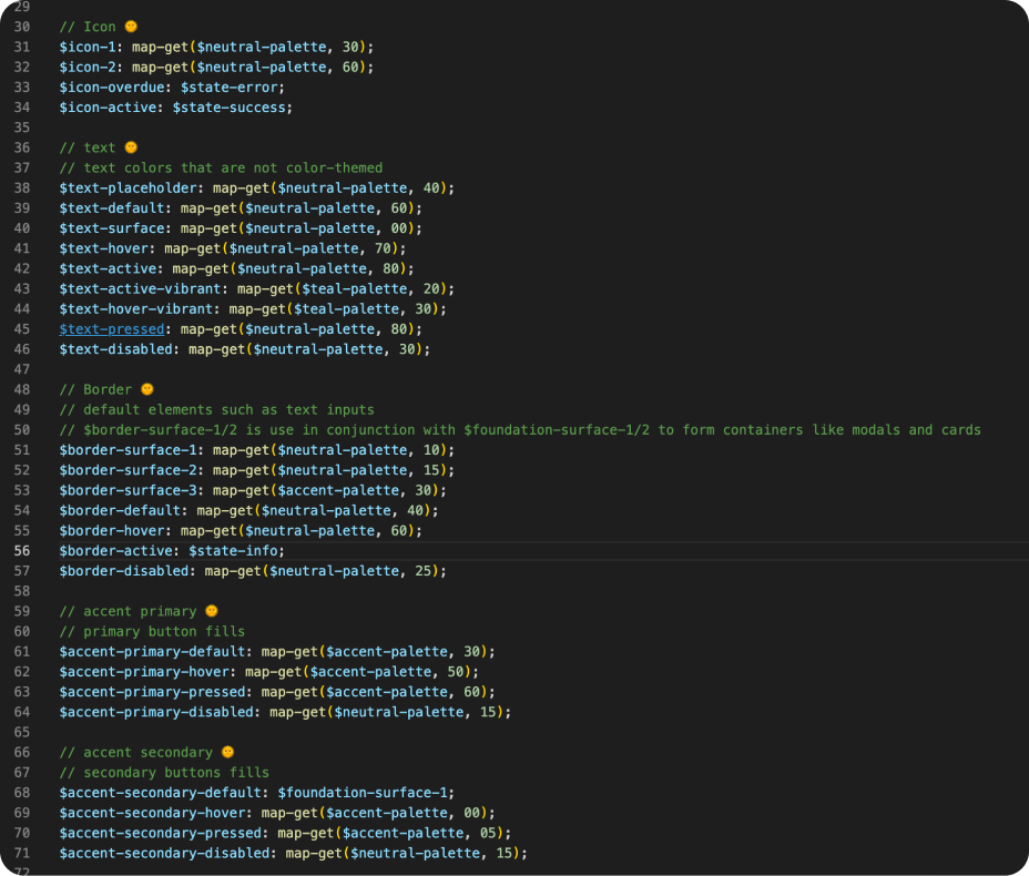
Variable-naming
The variable naming went through a few iterations with the help of my Engineer Lead Matt to avoid legacy naming clashes and match mental models on the engineering side.
Variable groupings
Foundation - This variable group is the most abstract. It creates the UI structure of pages, templates, and larger structures. The names are based on a three-dimensional approach of layering objects much like material design.
Base - represents the background of the UI composition
Surface - represents elements sitting on top of the base. This can be exaggerated by using shadows to push the surface further from the base.
Using these two variable groupings in conjunction with border variables, dramatic global style changes can be made with a handful of variables.
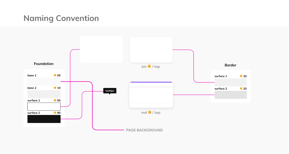
The other variable groupings are targeted towards specific affordances or functions. (e.g. primary & secondary buttons, icons, toggles, borders, etc. )
The $accent name represents elements that use an account’s chosen accent color in the application, which is labeled ‘accent color’ in the UI.
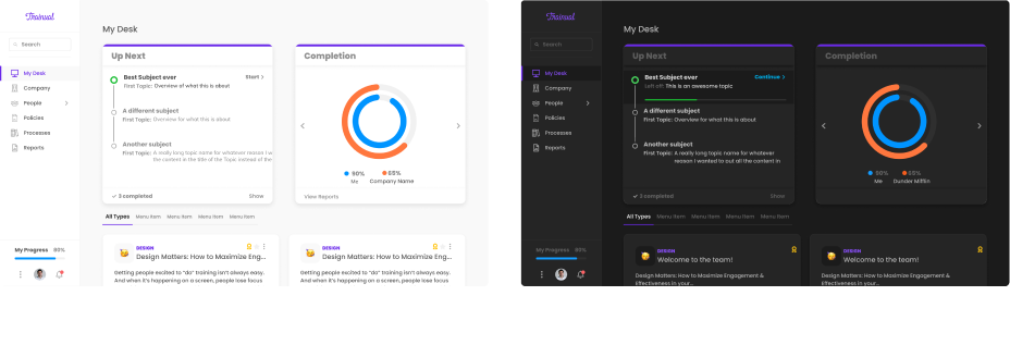
Dark mode
Dark mode was one of the key problems in this entire initiative; it was crucial that it be accounted for while architecting the system.
Dark mode is simple in theory. Just take the colors and reverse them.The tricky bit lies in file architecture and nuances of color perception. That’s where the Palette System's precision architecture really shines.
Dark mode palette
Because we are using static hex values instead of percentages, we have exacting precision over the values stored within our maps.
The dark mode palette’s value ranges have been narrowed and shifted towards darker values, and color saturation has been knocked back to mitigate eye strain.
Because the base display mode’s color is closer to black in dark mode, all the nest variables along the 12-step scale are flipped.
Theming
We call them theme variables because of the theme file layer. This layer is the canvas or UI, where all the application-specific variables are kept.
Because each step in the 12-step scale is based on contrast levels, the perceived contrast levels in dark mode remain the same, recreating the structure of the UI. And since the variable names remain the same in the light & dark theme files, one only has to map to a different palette value to make any adjustments.
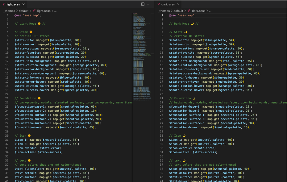
This layer allows us to go beyond the ‘default theme’, which is the application as it stands, including light and dark mode.
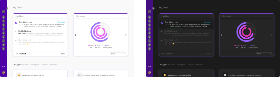
You can introduce any number of ‘themes’, like neon by changing the palette variables referenced in the theme layer.
LGTM
My engineering colleagues reviewed the files with me as I walked through the framework’s approach and potential.
Turns out I wrote some good code! Now we just needed to figure out how we would introduce the system with the legacy stylesheets and start to migrate frameworks. Spoiler alert; The front-end code was an absolute rats nest.