Table of contents
Start here 👇
Objectives overview
Tl;dr
Sparing you the lengthy but excellent case study, here's what matters:
Outcomes
A disconnected experience made it difficult for cusomers to see enough value to reach the aha moment within our 7 day trail window.
By re-orienting global architecture and navigation, we were able to accomplish several outcomes:
- Align closer with the product vision architecture
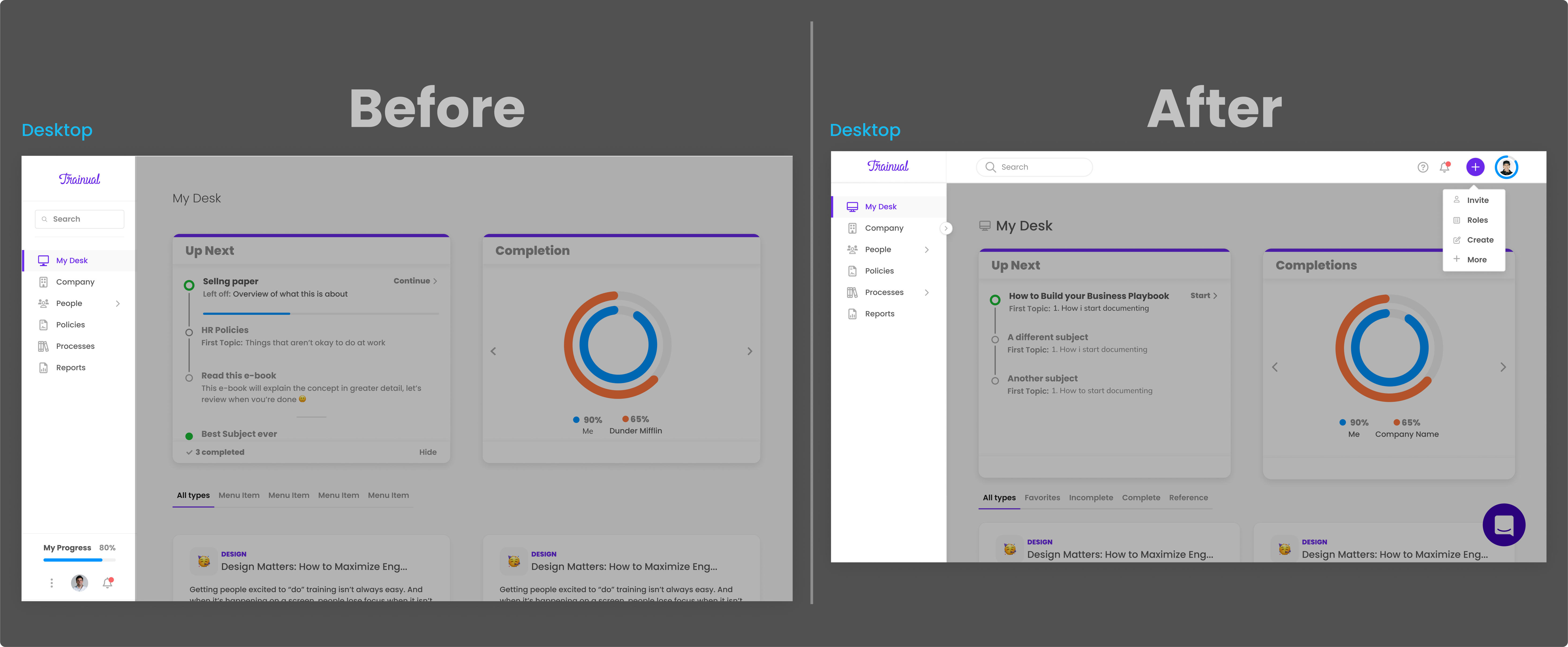
- surface key actions in prime visual realestate, leadin to a 4x increase in user invites.🔥
- Significantly reduce manual CX internvention during the trial window by making key resources easier to find
- Significantly increase usability and desireability with better design patterns
Before / After
Desktop
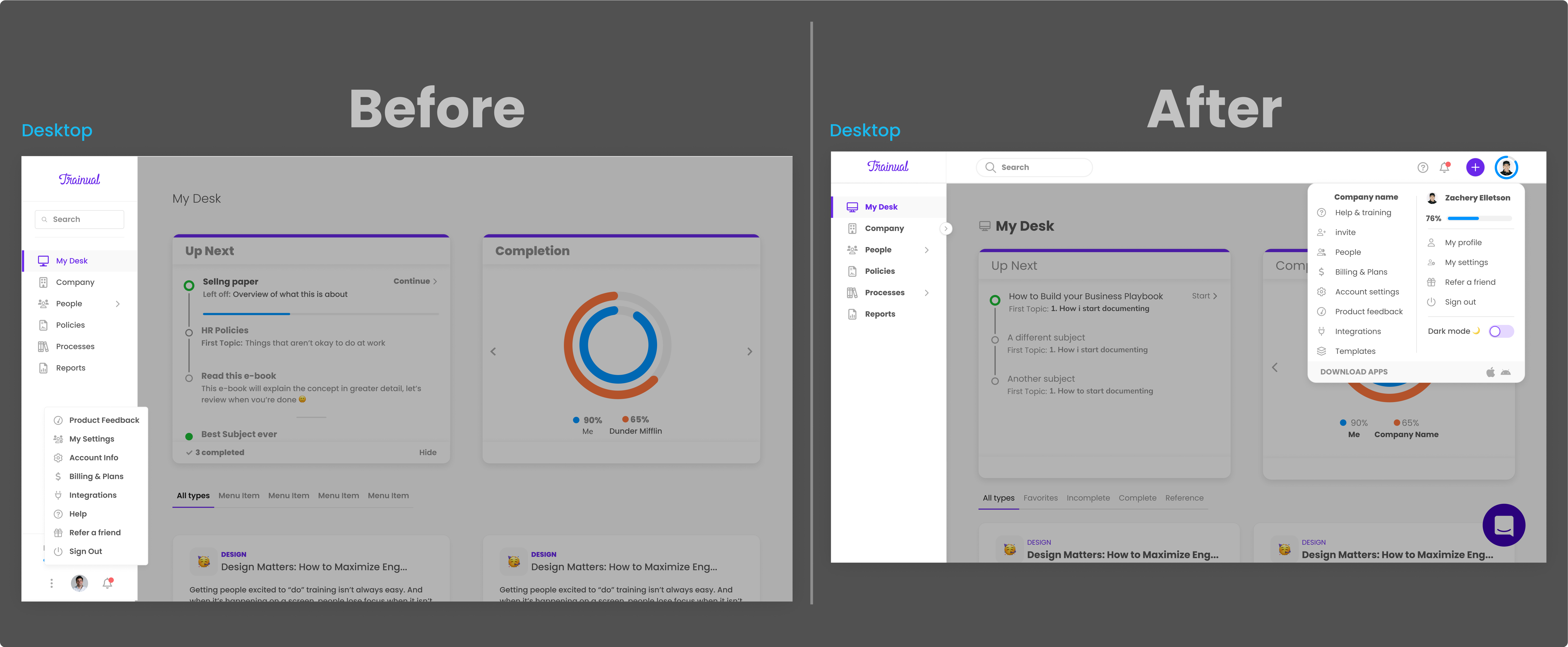
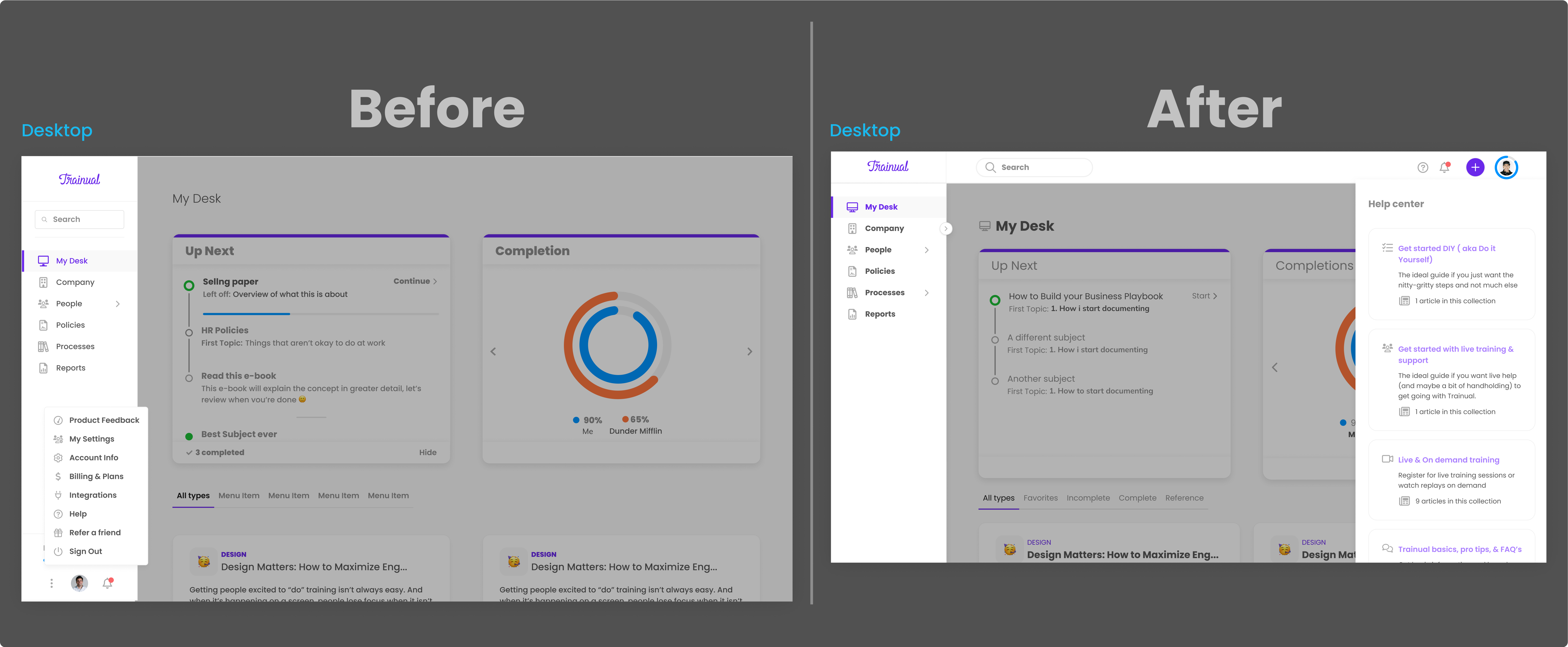
Here are a couple before/after screens of the largest UI changes (unrelated details are darkened). Check out the flows below to see more detailed annotations and changes in figma ↴


CX dealt with a influx of customer calls for basic resrouces that are in our help docs becuase they were hard to find

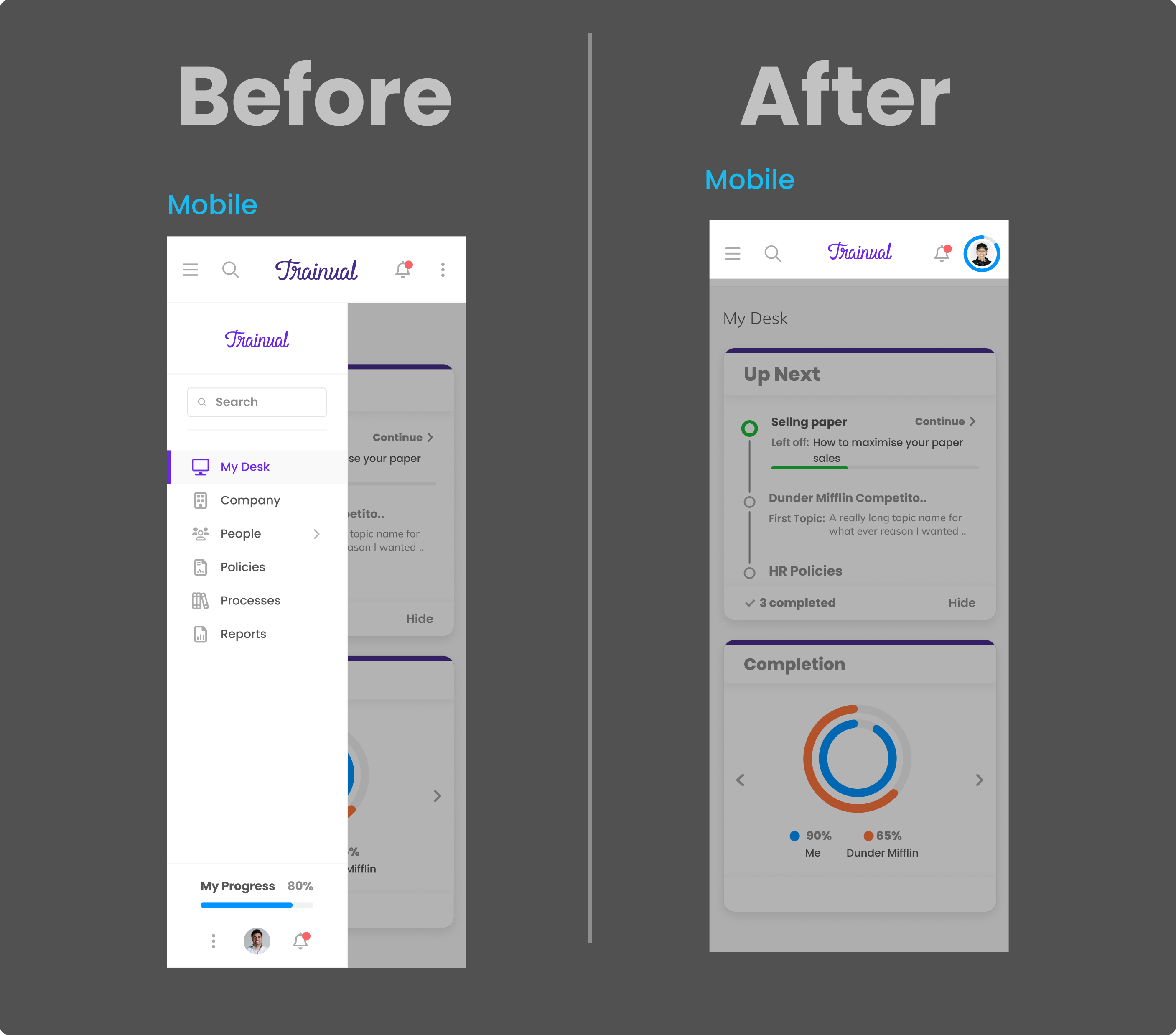
Mobile

.png)
Data tracking
.png)
Prototypes / flows
Prototype
Flows
Design thinking
Case study coming soon! ✍️

