Visiontype
A high-quality video artifact that evangelized the multi-year product vision and gave the company a picture to build toward.
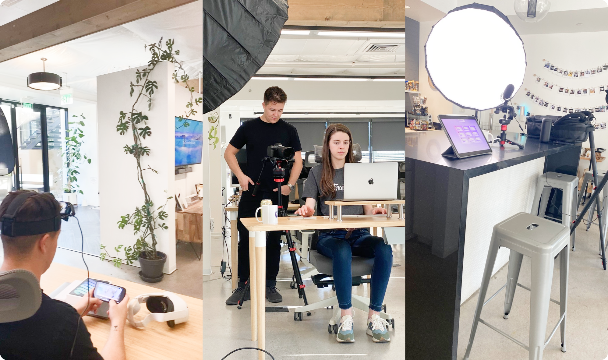
Facilitating the Visiontype review with stakeholders — storyboard shots that unpack the UI and product vision.
Act 1 — The Bet
The product vision — looking a few years out — couldn't be a deck. It had to be a story — an inspirational video the company could feel — not slides interpreted on the way out of a meeting. The bet was that if it felt tangible, every team would have an easier time executing against it.
Act 2 — Constraints & Cost
Trainual was pivoting product strategy at the same time it was scaling the PD&E org. Squads were absorbing technical debt while onboarding junior talent, and the product experience and vision was fragmenting. Visiontype was the response — a single cohesive picture that aligned squads, the board, and investors on where the product was going, while squads kept shipping inside their own product areas. To be believable, it had to be three things at once — cross-platform, technically feasible inside the team we actually had, and structured so each squad could implement a piece without coordination overhead.
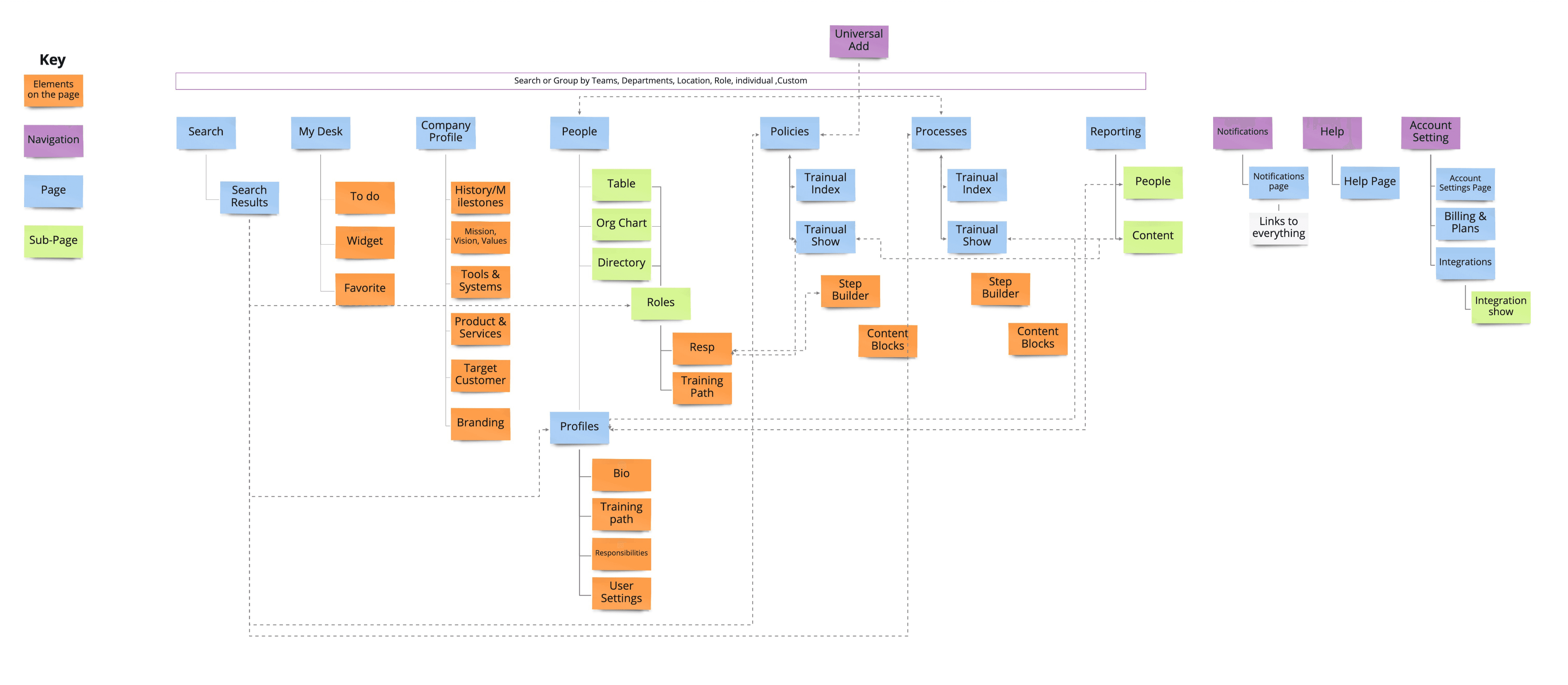
In practice, the work was two phases: a sitemap planning phase with founders, product, and engineering leadership — current state and future state mapped out together — then a few weeks of head-down solo design to turn that architecture into the video. Squads kept their core roadmaps moving the whole time. The bet was that a single landed artifact would be worth more than the next sprint of incremental work.
Act 3 — Decisions & Tradeoffs
Architect the future before the screens
This came first — before any screens or UI existed. The sitemap architecture — current state and future state — was built in collaboration with founders, product, and engineering leadership, mapping every surface and the shared elements that cut across them. The point was to make sure the vision wasn't a series of pretty screens connected by hand-waving, but a navigable system with components an engineering team could actually implement. That architecture is what made the few weeks of head-down prototyping possible — every frame later drawn had a node here.
A story video, not a deck
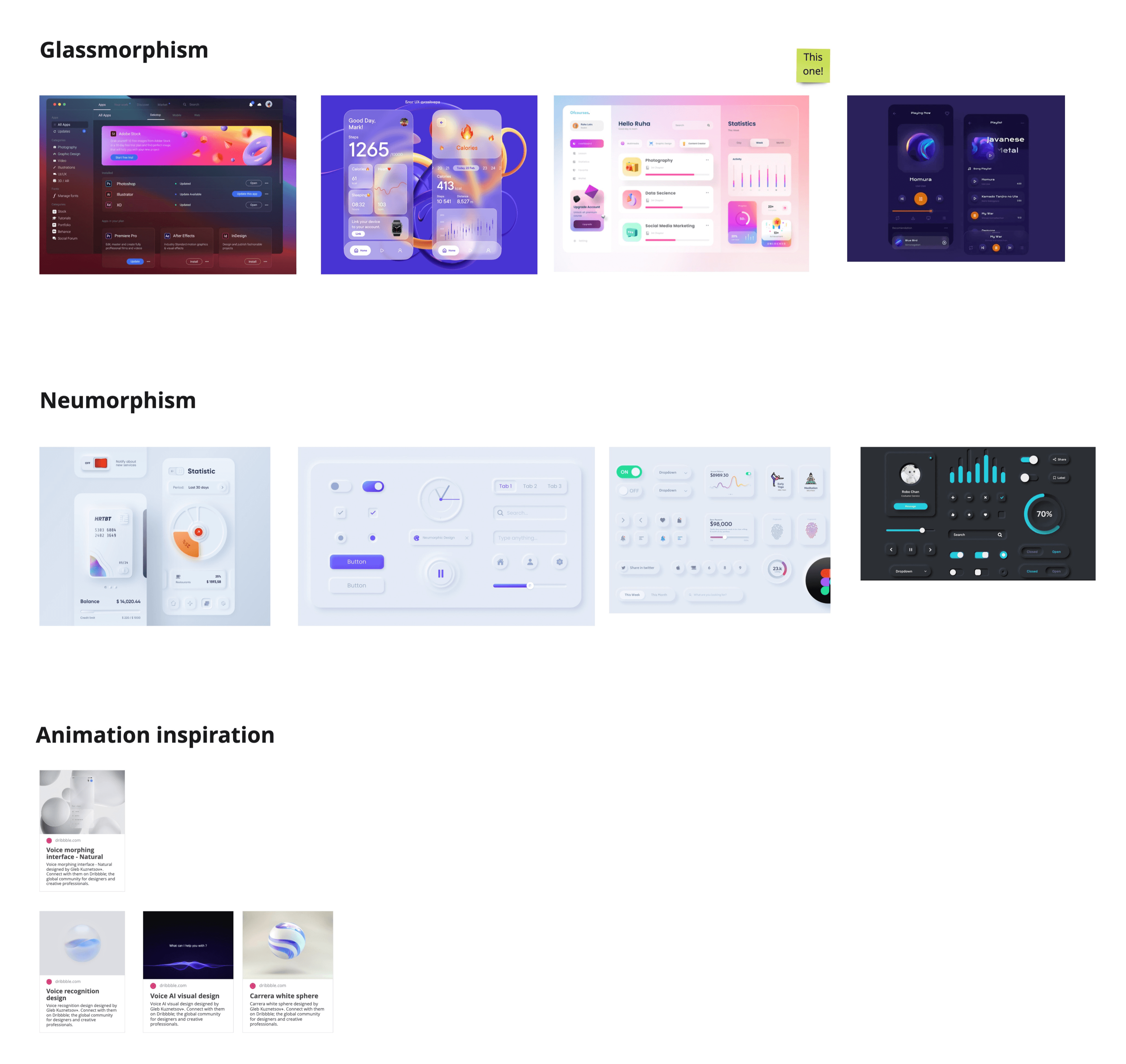
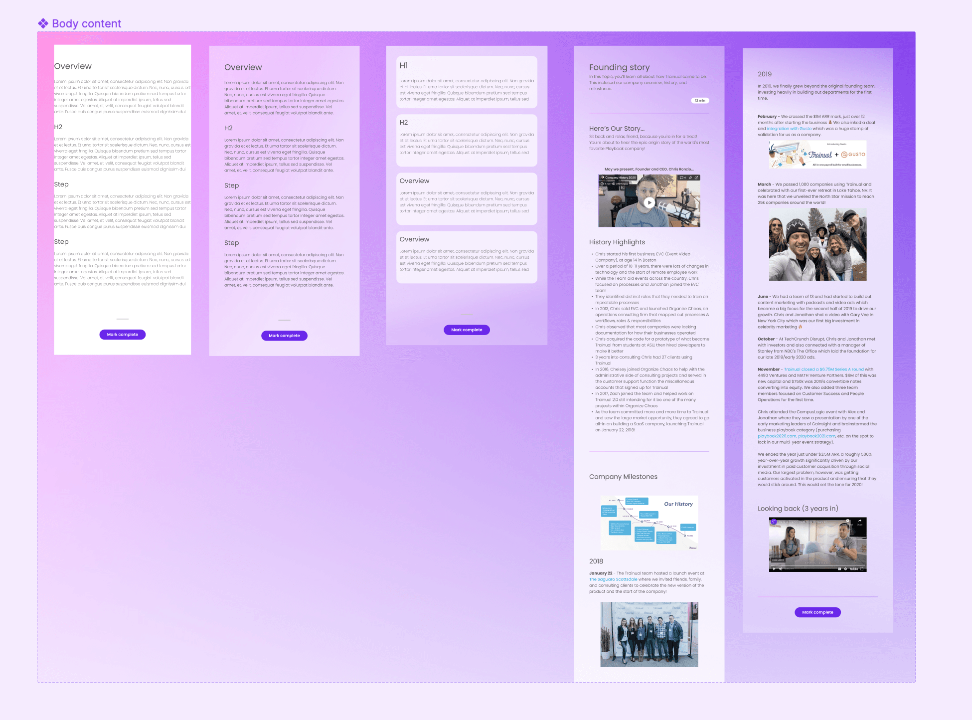
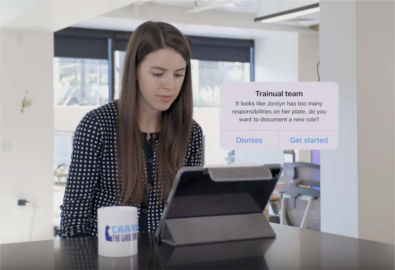
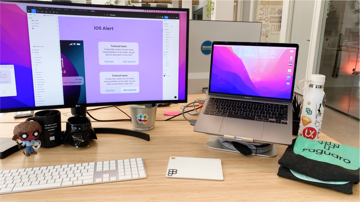
The first call was format. A vision deck reads in five minutes and dies in a week; a story video — built from a real Figma prototype so every claim materialized as an actual screen — gives the company something they remember. The constraint was time — a few weeks to build something convincing across hundreds of frames — so the scope stayed ruthless: only the core interactions and a tight design-system language that could compose at speed. The aesthetic was glassmorphism (translucent panels, depth-aware blur, layered surfaces) — years before Apple rolled out Liquid Glass as the system-level language for iOS. The video became the artifact people referenced for months after the all-hands.
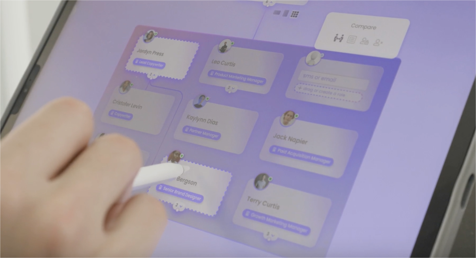
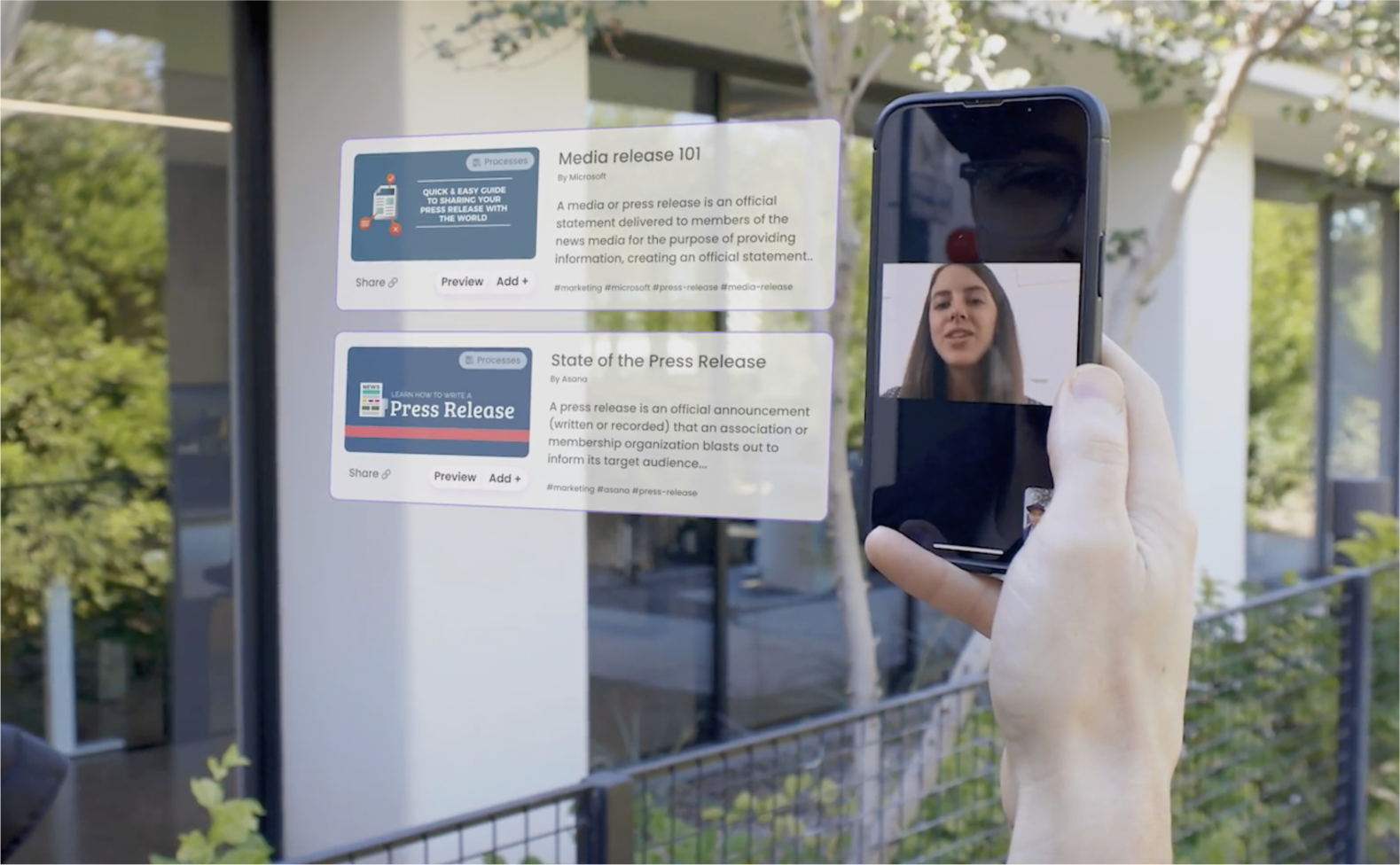
One visual language across desktop, mobile, tablet, and AR/VR
Cross-platform was a constraint the executive team set, so the question was how to express it without designing four parallel systems. The answer was glassmorphism — a translucent, depth-driven visual language that could carry across surfaces without re-skinning. It was trendy in 2022 and that was a real risk; the call was that visual coherence across the demo mattered more than picking a more conservative system that would have splintered between device classes.
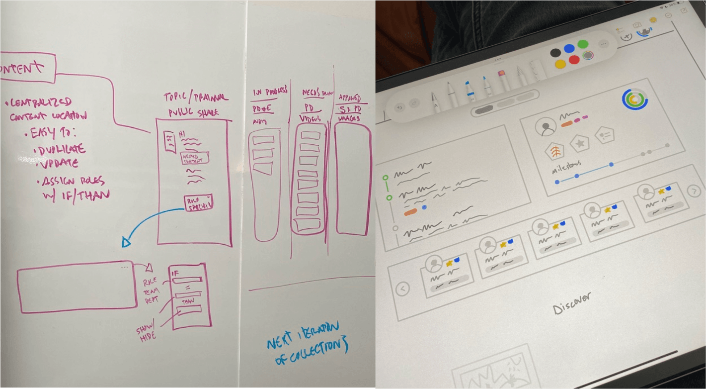
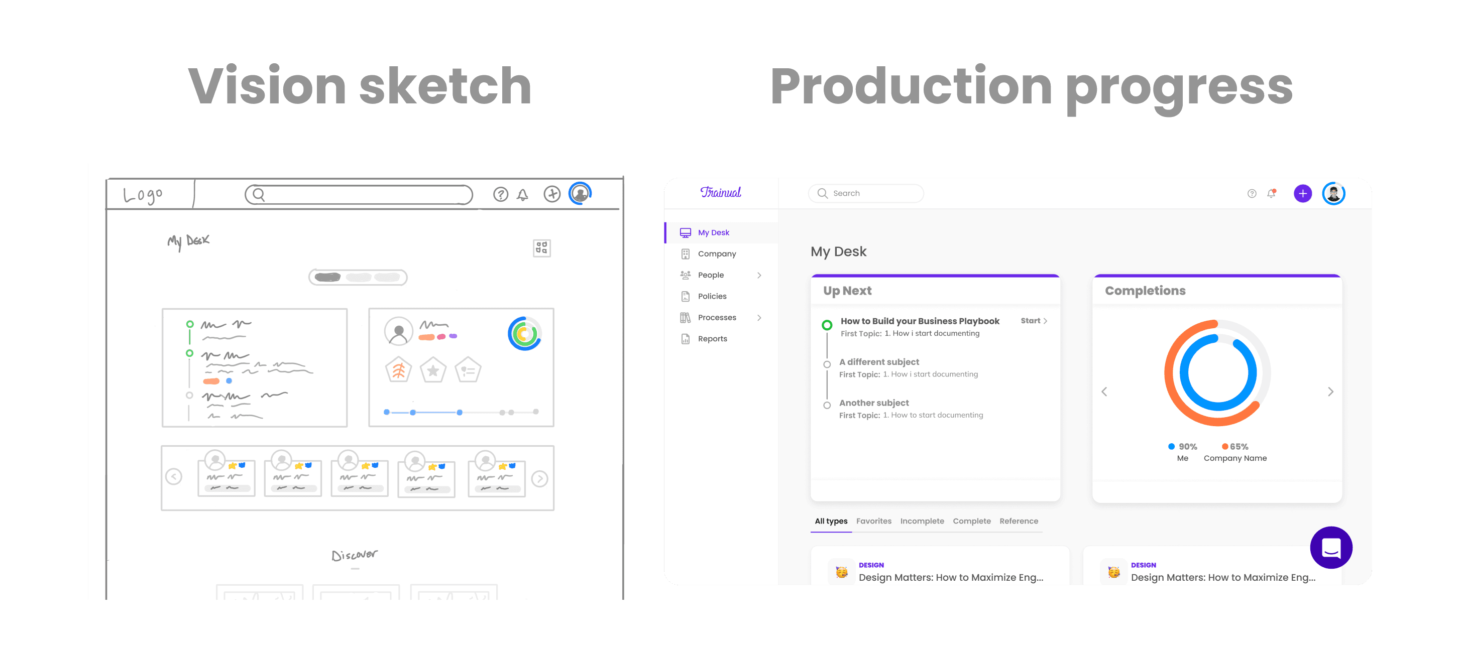
Sketches to bridge current reality to vision
The prototype came first. The all-hands deadline didn't leave room for a conventional discover-define-design rhythm — building directly in Figma under deadline pressure was the only path to the demo. The sketches that mattered most came afterward, with a different job: illustrate the whole vision concept to the PD&E org and draw the line from the current reality to where the product was heading. The prototype proved the vision was buildable; the sketches made it legible to the people who'd actually have to implement against it.
Act 4 — Outcome
Visiontype rolled out at the Q2 all-hands and what it produced went beyond a single meeting:
- Reference, not recording. The video became the artifact people pointed at when the vision came up later; new joiners ramped through the videography team's walkthroughs instead of rewinding a recorded all-hands.
- Independent implementation. Product, design, and engineering moved against the same picture, which let squads start building against the vision without waiting on more centralized framing.
- Components survived to production. The structural moves in the sketch — widget grid, progress component, surface architecture — shipped in My Desk 2.0; the vision wasn't decorative.
The clearest example of that survival is the My Desk 2.0 page — the vision sketch's widget grid, progress component, and surface architecture all shipped, intact.
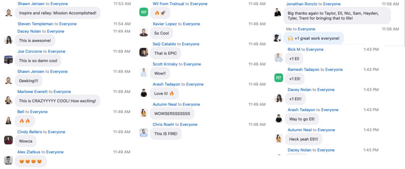
The room's reaction landed how vision work needs to land — short, loud, in the moment:
"Inspire and rally: Mission Accomplished!" — Shawn J.
"This is so damn cool." — Joe C.
"This is CRAZYYYY COOL! How exciting!" — Marlowe E.
"That is EPIC." — Seiji C.
"THIS IS FIRE!" — Chris R.
Act 5 — Reflection
The honest mistake was timing the rollout against the strategic pivot rather than ahead of it. By the time Visiontype landed, the org was already absorbing the pivot's velocity hit and the vision came in on top of fatigue that earlier framing could have softened. A version of this work that preceded the pivot — even by a quarter — would have given the org a destination to pull toward instead of a destination to interpret while running. The lesson, which carried directly into the design-system work that followed, was that the artifact that aligns an org has to land before the decisions it's meant to align, not alongside them.