Saguaro Design System
A design system shipped as real, version-controlled SCSS — not a Figma-only token set.
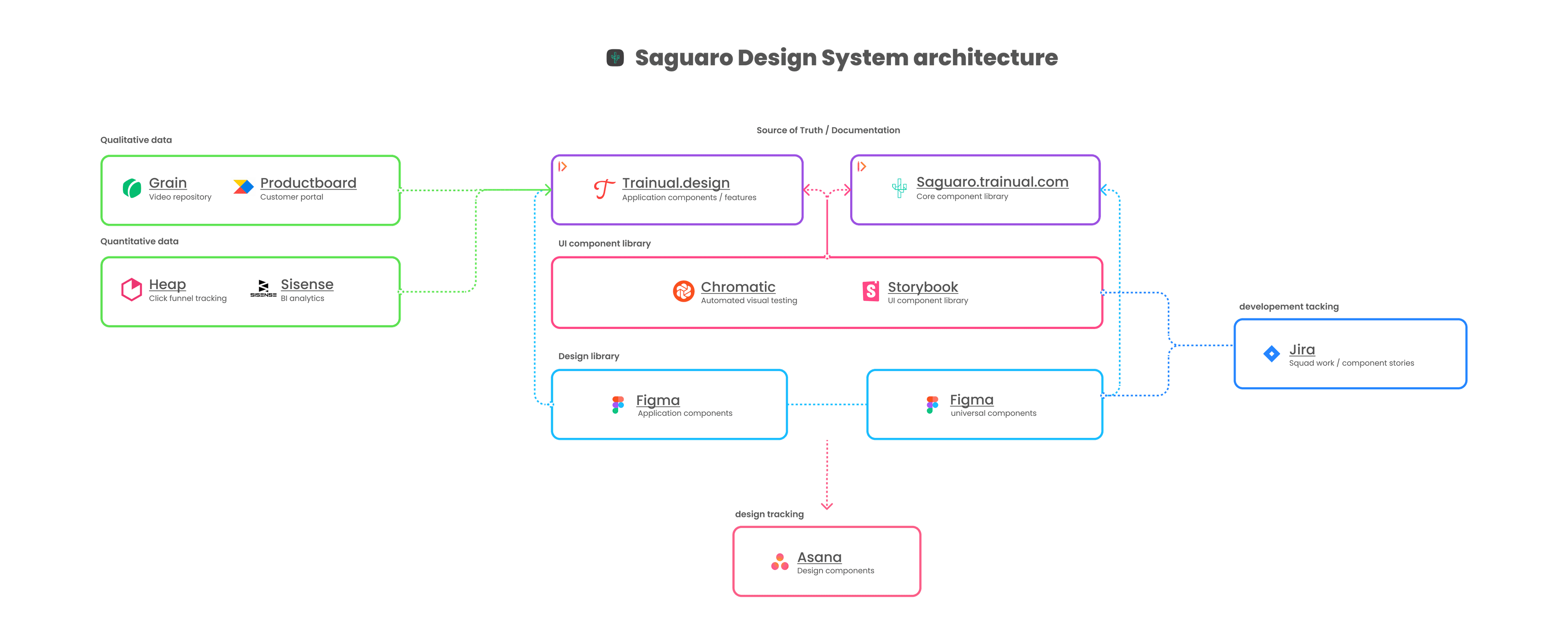
saguaro.trainual.com — still live. The Zeroheight surface that knits Figma + Storybook + docs into one parity loop. The palette SCSS that grew out of this work has its own case study; this is the system that made it possible.
Act 1 — The Bet
Treat the design system as engineering work, not a design artifact: build it where engineering builds, own it through engineering co-owners, defend it against the same review systems that gate features. That meant a Figma library that paired one-to-one with a Storybook component library in React + TypeScript, both fed from documentation that engineers wrote alongside shipping work. The cost was that the design lift, the political lift, and the engineering lift all had to happen in parallel, inside an org that didn't yet understand why a design system needed engineering investment in the first place.
Act 2 — Constraints & Cost
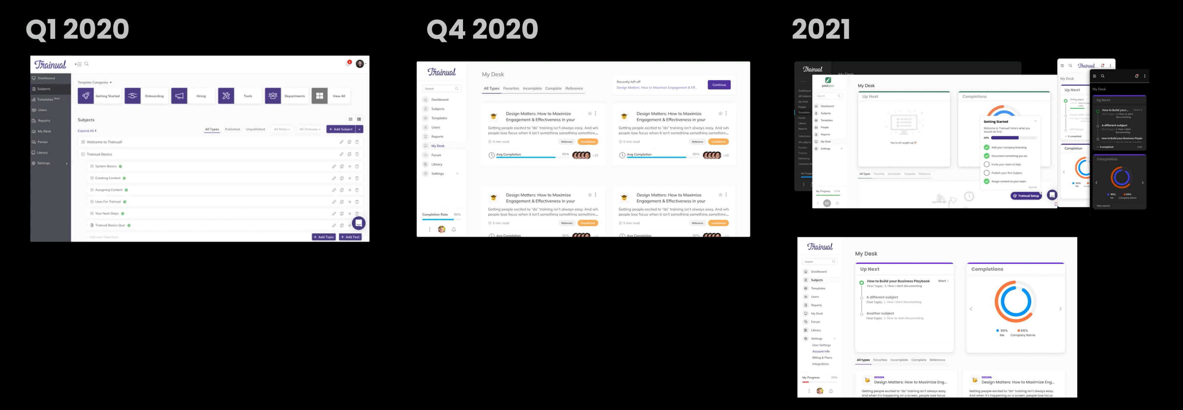
I joined Trainual in early 2020 to take over a redesign already six months behind schedule from an external contractor. The work was nominally 75% complete, but what had been delivered was a style sheet rather than a component library — engineering was building against an inconsistent surface, and the product's brand-style feature let customers set their own button and link colors, meaning the primary purple could be re-skinned to orange, yellow, or red. It was an accessibility nightmare by construction.
The team had no real Figma library yet, no token discipline, and Figma in 2020 didn't have variants or variables. Component architecture had to be hand-rolled. My design peer was uninterested in systems work, and the leadership response to my requests for a second system designer was budgetary refusal. The cost was that the system work fell to one person at the same time the org was scaling squads.
Six months in, my performance review came back with no increase — the design-system work wasn't legible to a leadership team that measured designers on initiative throughput. The suggestion from my direct report was to drop the system work entirely. The uncomfortable lesson was that a system has to be defensible in the language the org already understands. The next phase had to be one where the system's value showed up in initiative velocity, not in slide decks about design.
Act 3 — Decisions & Tradeoffs
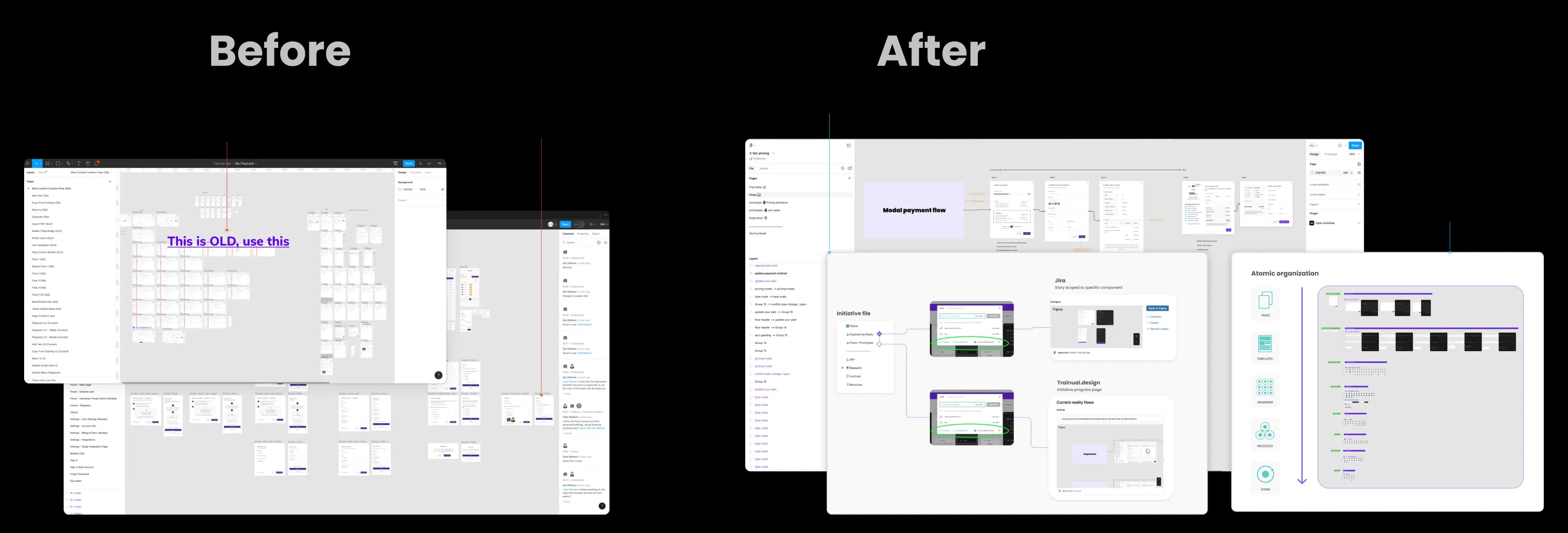
Re-architect the inherited Figma file as a real component library
The first call was what to do with what I'd inherited. The contractor's handoff was a style sheet — a document describing how the UI looked — rather than a component library that engineering could build against. Figma in 2020 had no variants and only a primitive auto-layout, so every interactive component had to be hand-built across light/dark, hover, focus, disabled, with name conventions that would survive the arrival of the variants feature (which I knew was coming). The tradeoff was time — months of foundation work invisible to leadership — against the alternative of letting the existing stylesheet calcify into the surface that every squad ran against. Worth it. By the time Figma shipped variants in 2021, the library was already structured around them, so the migration was a refactor rather than a re-do.
Pick Zeroheight as the docs surface — and defend the choice
Leadership pushed back hard on Zeroheight. The pushback was sensible in shape — why aren't we documenting our design system in Trainual, our own documentation product? — but it ignored the engineering reality: Trainual at the time had no Figma integrations and no API, so it couldn't pull live design and code components into a doc page the way Zeroheight could. Using Trainual would have meant maintaining documentation by manual screenshot, divorced from the source of truth in Figma and Storybook. I had to make that case more than once. The decision held because the alternative would have produced documentation that drifted from the system within a sprint.
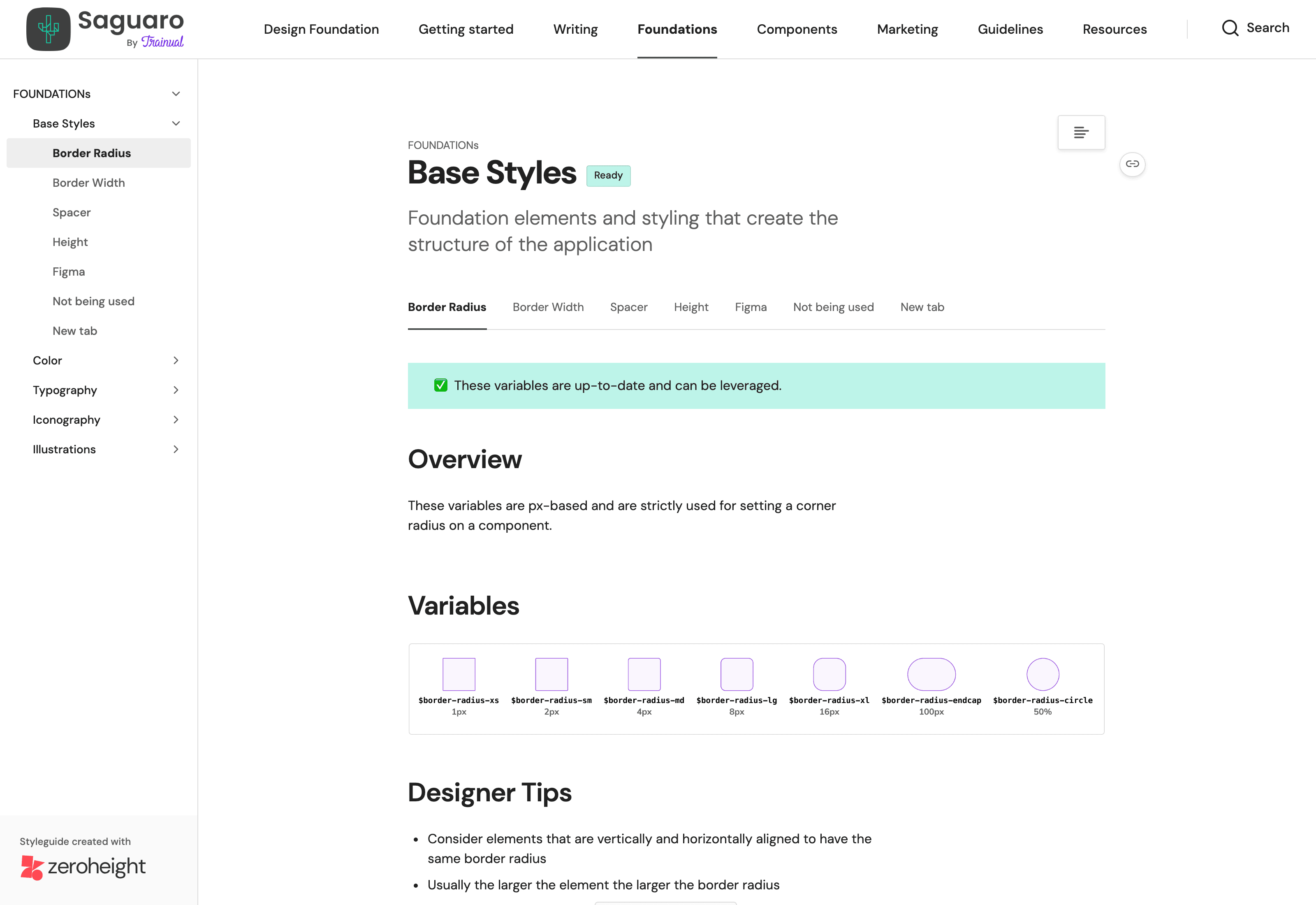
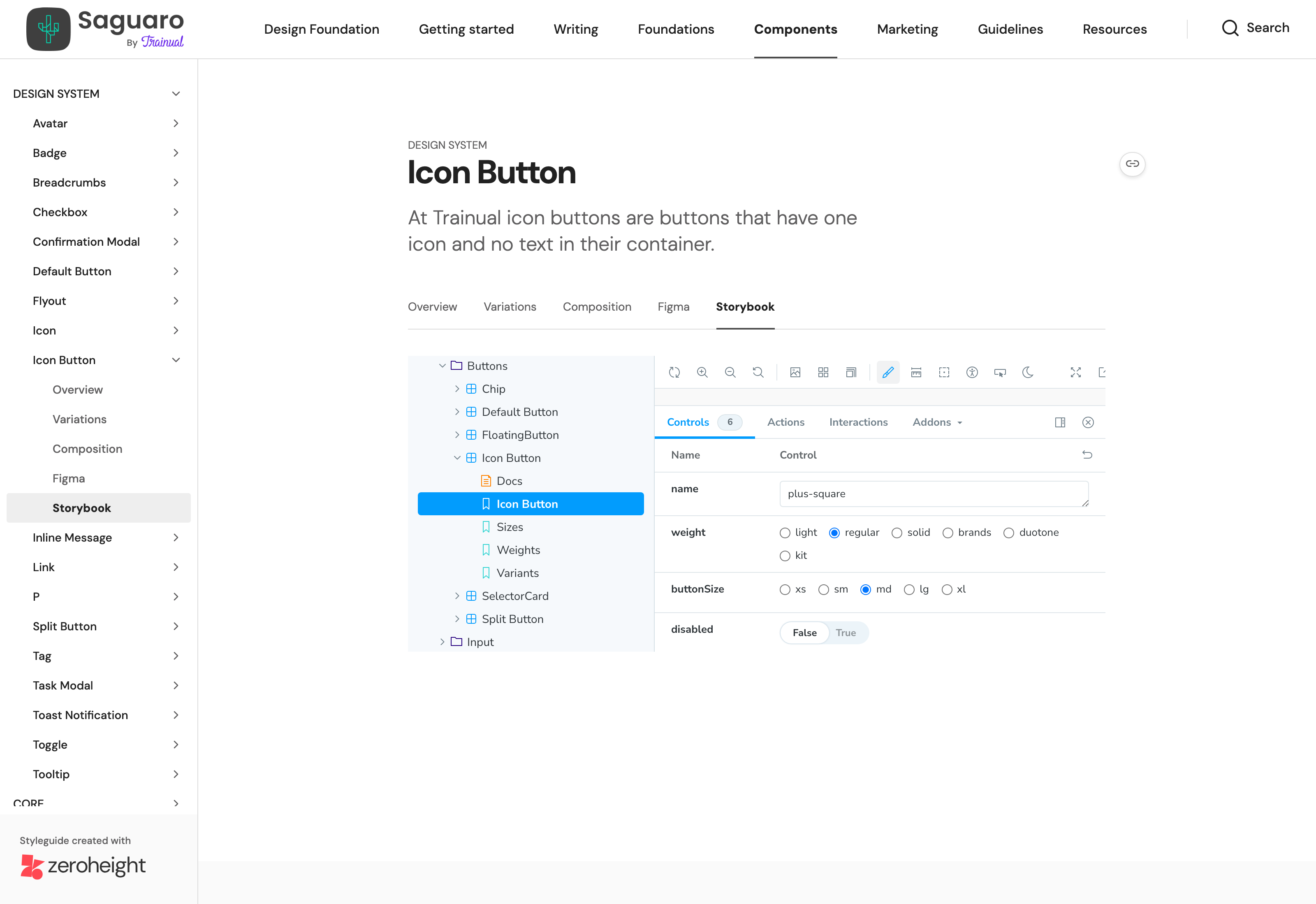
Figma + Storybook + Zeroheight as a parity loop
The third call was the workflow. Storybook UI held the live components in React + TypeScript; Figma held the design components; Zeroheight knit the two together with documentation that pulled from both. The result was a three-way parity check: a discrepancy in any one surface was visible from the other two before it shipped. Designers and engineers caught divergence in real time instead of during release QA, which is where stylesheet drift had historically hidden.
Grow the system by growing the team
The fourth call was who owned the system. Solo-owned systems die when the owner leaves; system squads scale when contribution is structured. Once Jen Fox joined as Design Lead, we used the system's accumulated proof to argue for dedicated systems headcount: a UI designer (Alex) who took ownership of the component library, then eventually a full design system squad. The transition required writing down what had been informal — a 30-60-90 onboarding plan for Alex, a contribution ladder for how squads proposed components into the system, documented quality bars for what shipped. The tradeoff was authoring overhead. The offset was that the system stopped depending on me to exist.
For the foundational color architecture that powered Saguaro — the SCSS palette, the brand-vs-theme decoupling, the migration through the legacy stylesheets with Matt — see the Palette System case study, which deep-dives the sub-initiative that Saguaro is built on.
Act 4 — Outcome
By the time the team grew through 2022, Saguaro was the substrate every squad shipped against. The development-time cost of new UI work dropped by roughly a third, design iteration speed by roughly half, and component reuse across squads reached ~90% — numbers that aligned with what the org could feel in cycle time even without instrumentation.
The system is still live. Three surfaces, one source of truth:
- GitHub — trainual/saguaro — the open-source repo. Public, with the React + TypeScript component source, the SCSS palette, and the migration history.
- Storybook — the live component browser. Every component renders with its prop surface so designers and engineers can compare against the Figma library in the same window.
- Zeroheight — saguaro.trainual.com — the docs surface. Ties the Figma library and Storybook components together with usage guidance, design rationale, and color-perception docs.
What carried the system through the strategic pivots of 2021 — the cancelled Collections initiative, the Playbook Push, the new pricing architecture — wasn't the documentation. It was the architecture itself. Components built against the system survived the pivots because the foundation was real engineering code, not slides about a system; rebuilding surfaces against new pages cost minutes per component instead of hours. By the time I handed the work off, Saguaro had a dedicated design system squad, a contribution ladder, and a system identity that didn't depend on me.
"Already making converting designs to dark mode 4x faster and 4x less brain power." — Tyler R., Product Designer
"This is the best internal design documentation I've ever seen. Especially the color perception section, freaking amazing." — Jared G., Senior Engineer
"The design system you built at Trainual is so light years ahead — you have no idea." — Tyler R., Senior Product Designer
Act 5 — Reflection
The honest lesson from Saguaro is that systems work survives leadership churn only when the system itself is defensible as engineering work, not as design taste. The Figma library was a design artifact and would have been the first thing cut in any prioritization meeting; the Storybook component browser and its tie into the codebase was an engineering artifact and couldn't be cut without breaking shipped surfaces. The system survived strategic pivots because the parts of it that mattered most were the parts engineering already owned.
The mistake I'd correct, if I were redoing it, is timing on dedicated headcount. The system needed a second pair of hands earlier than I argued for them — the year of solo lift was a tax I paid for not making the velocity case loudly enough. Design systems don't get funded as design; they get funded once leadership can read the velocity number. Saguaro made that case retroactively. The next system I built would make it up front, before headcount got requested.