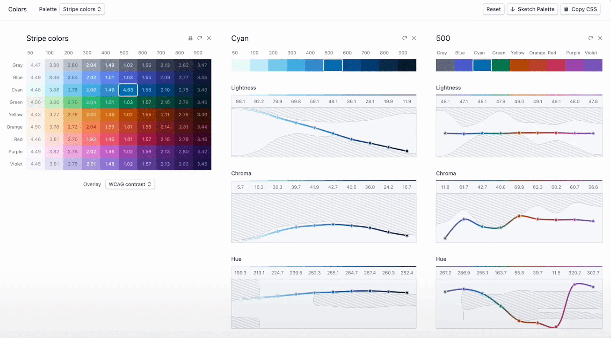
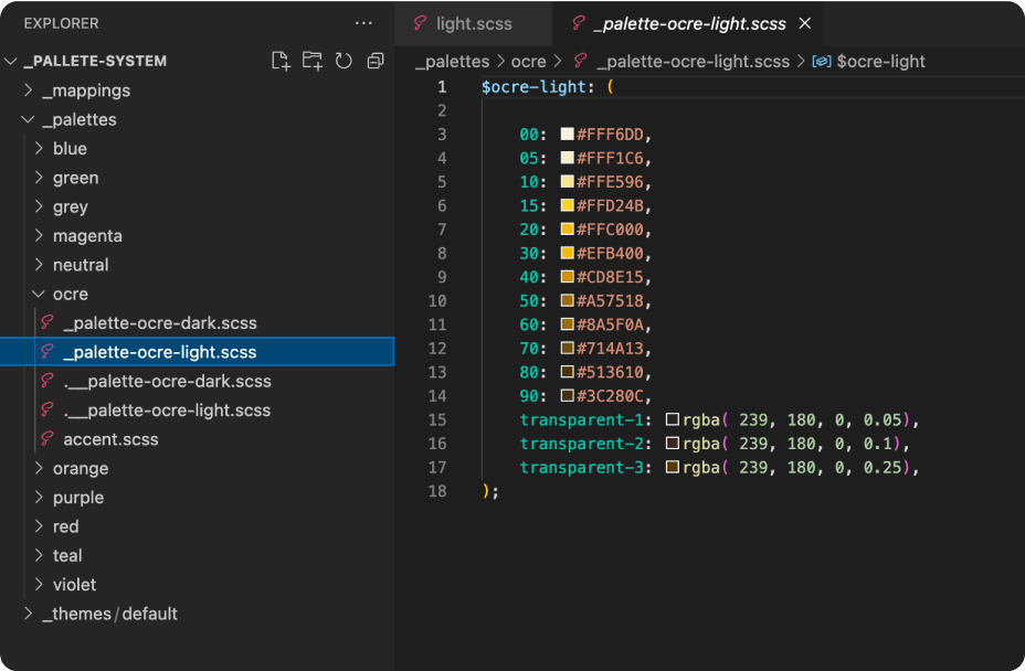
Palette System
Replacing Trainual's broken SCSS color foundation with a perceptually-uniform system that fixed accessibility, dark mode, and the white-label feature in one architecture.
// Saguaro — palette + theme map (representative excerpt)
// Full production source is ~38KB; this excerpt shows the architecture shape:
// a perceptually-tuned spectrum, a semantic token layer composed from it,
// and themes that swap by reference rather than by duplication.
// 1. The spectrum --------------------------------------------------------
// Each hue is sampled at 10 perceptual steps. Step 500 is the brand anchor;
// step 50/950 stay within WCAG AA against their inverse on every hue, so
// dark mode is a derivation rather than a parallel re-skin.
$hue-purple: (
50: hsl(265, 100%, 97%),
100: hsl(265, 95%, 92%),
200: hsl(265, 88%, 84%),
300: hsl(265, 82%, 73%),
400: hsl(265, 76%, 62%),
500: hsl(265, 72%, 52%), // brand anchor
600: hsl(265, 70%, 44%),
700: hsl(265, 72%, 36%),
800: hsl(265, 76%, 28%),
900: hsl(265, 82%, 20%),
950: hsl(265, 88%, 12%),
);
// $hue-blue, $hue-green, $hue-amber, $hue-red, $hue-neutral, ...
// (declared the same way; omitted here for brevity)
// 2. Semantic token map --------------------------------------------------
// Components never reach into the spectrum directly. They consume semantic
// tokens, which compose from the spectrum at a single layer of indirection.
@function token($name, $theme: $theme-light) {
@return map-get($theme, $name);
}
$theme-light: (
surface-base: map-get($hue-neutral, 50),
surface-raised: #fff,
surface-sunken: map-get($hue-neutral, 100),
text-primary: map-get($hue-neutral, 900),
text-secondary: map-get($hue-neutral, 600),
text-on-brand: #fff,
border-subtle: map-get($hue-neutral, 200),
border-strong: map-get($hue-neutral, 400),
brand-default: map-get($hue-purple, 500),
brand-hover: map-get($hue-purple, 600),
brand-pressed: map-get($hue-purple, 700),
feedback-success: map-get($hue-green, 500),
feedback-warning: map-get($hue-amber, 500),
feedback-danger: map-get($hue-red, 500),
);
// 3. Dark theme as a derivation -----------------------------------------
// Dark mode inverts the value axis on the same hue scale. No new colors
// are introduced — the spectrum itself does the work.
$theme-dark: map-merge($theme-light, (
surface-base: map-get($hue-neutral, 950),
surface-raised: map-get($hue-neutral, 900),
surface-sunken: map-get($hue-neutral, 925),
text-primary: map-get($hue-neutral, 50),
text-secondary: map-get($hue-neutral, 300),
border-subtle: map-get($hue-neutral, 800),
border-strong: map-get($hue-neutral, 600),
brand-default: map-get($hue-purple, 400),
brand-hover: map-get($hue-purple, 300),
brand-pressed: map-get($hue-purple, 200),
));
// 4. White-label override ------------------------------------------------
// The brand-style feature replaces only the brand-* tokens at runtime,
// not the underlying spectrum — so customer overrides cannot break
// accessibility contracts elsewhere in the system.
@mixin apply-brand($brand-hex) {
$scale: generate-perceptual-scale($brand-hex);
--brand-default: #{map-get($scale, 500)};
--brand-hover: #{map-get($scale, 600)};
--brand-pressed: #{map-get($scale, 700)};
--text-on-brand: #{contrast-of(map-get($scale, 500))};
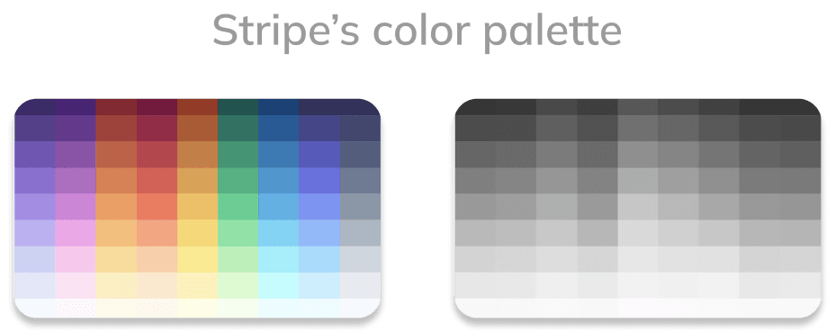
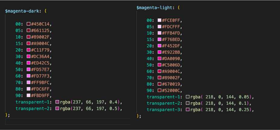
}The palette + theme map in SCSS — the actual code that became the foundation. Saguaro is the system this code powers.
Act 1 — The Bet
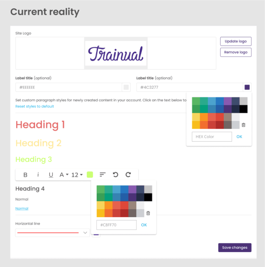
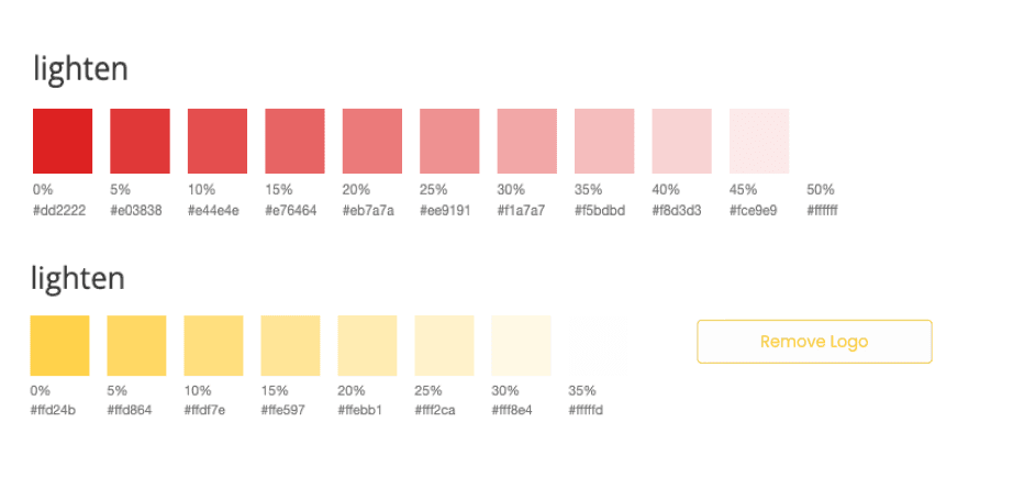
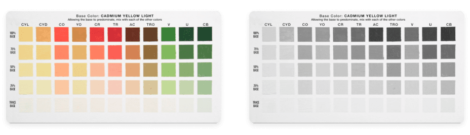
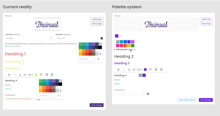
Trainual's color foundation was a wall of SCSS lighten() and
darken() calls with hard-coded percentages — a system that
couldn't carry a custom brand, couldn't carry dark mode, and
couldn't carry accessibility without rebuilding from scratch each
time. The work was to replace it with a perceptually uniform
color system that could carry all three at once.
Act 2 — Constraints & Cost
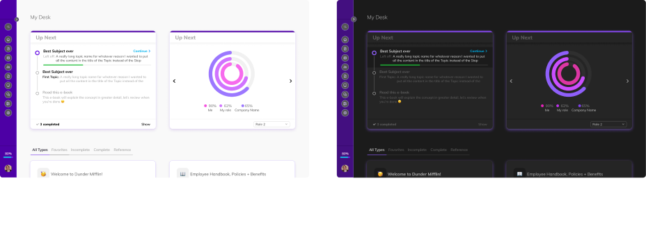
The problem was structural. Trainual's brand-style feature let customers
pick any color as their primary, and the existing SCSS used
lighten($base, X%) and darken($base, Y%) to derive hover, pressed,
and secondary states. With a fixed percentage, the derivations broke at
the extremes — a light brand color washed out completely when "lightened"
by 45% for a secondary button background; a dark brand color produced
unreadable contrast in dark mode. Most of the brand colors customers
picked produced WCAG-failing UI somewhere in the stack.
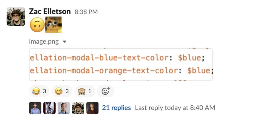
The same lighten/darken pattern propagated everywhere. Variables were
duplicated across half a dozen stylesheets, !important overrides
defended themselves against other !important overrides, and naming
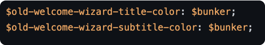
conventions changed file by file ($bunker was a real variable name).
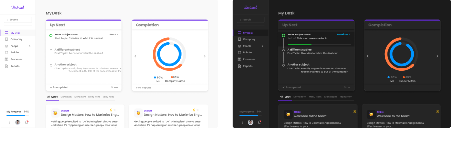
Dark mode had been added quickly during a separate squad's sprint and
was almost completely undocumented — design files had to back into hex
values from Figma frames because no styles existed.
The team's appetite for a full color-system rewrite was low. We had no allocated resources for design-system work. The plan was to fit the architecture into an active product initiative — My Desk 2.0 — so the work would ship as part of feature delivery, not as standalone "infrastructure." That was the only framing that would get the work prioritized.
Act 3 — Decisions & Tradeoffs
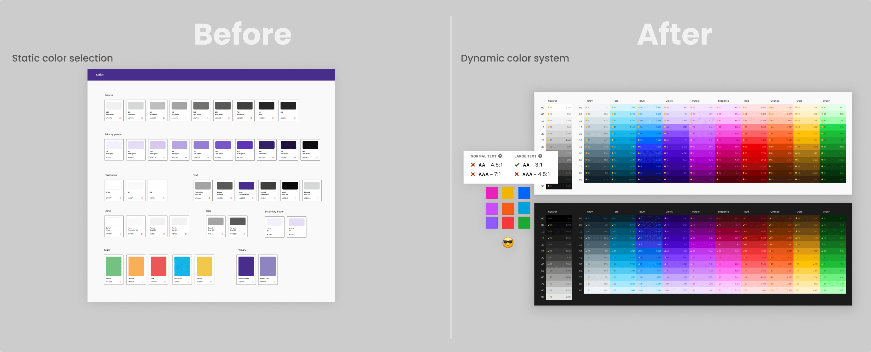
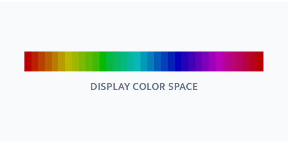
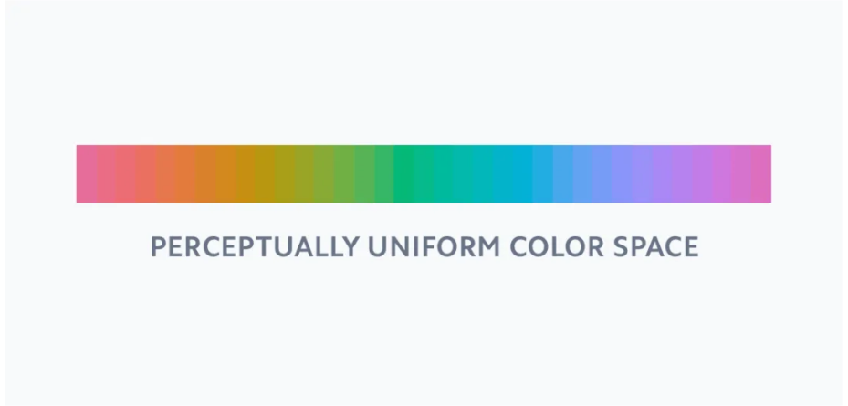
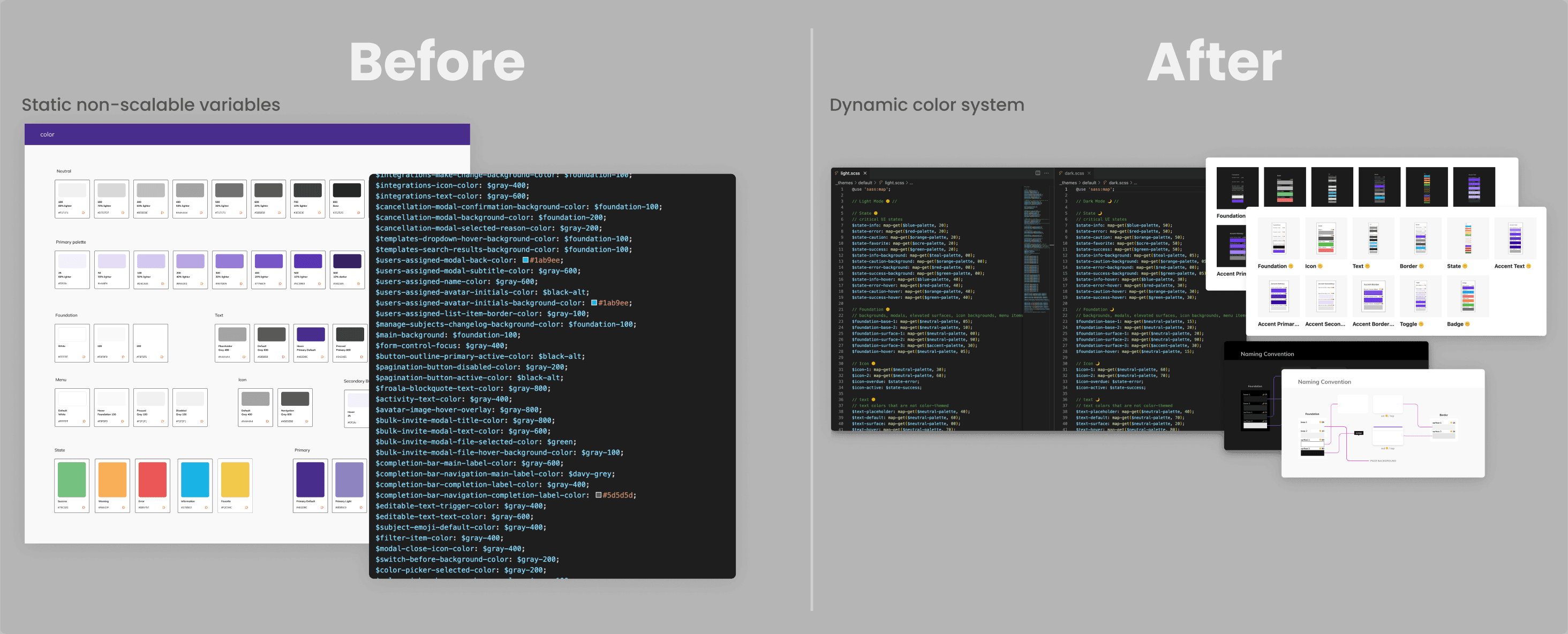
Stop deriving colors; declare them perceptually
The first decision was to abandon programmatic lighten / darken
entirely. Each hue would be sampled at twelve perceptual steps — tuned
for consistent perceptual lightness, not consistent mathematical
percentage. A button's hover state didn't come from lighten(brand, 10%); it came from a sibling shade in the same palette. Dark mode
became a derivation of the same hue scale, not a parallel re-skin.
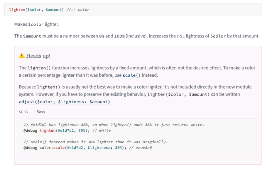
The tradeoff was up-front authoring cost — every hue had to be hand-tuned at every step to maintain perceptual uniformity. Worth it. After the migration, designers and engineers picked named tokens out of a small set, and the lighten/darken math vanished from the codebase.
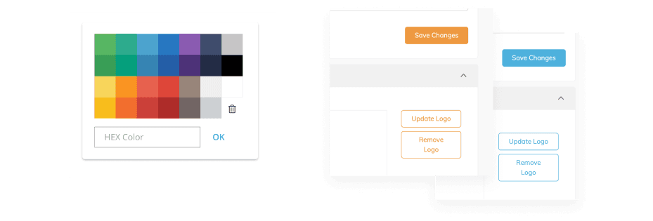
Decouple brand from theme
The second decision was structural. Customer brand colors couldn't be allowed to drive the whole UI directly anymore — that was the source of the accessibility failures. The solution: a thin "brand" layer applied only to the affordances that needed to carry the customer's brand (primary buttons, links, highlights), with everything else (text, surfaces, borders) drawn from theme tokens that were always WCAG-compliant. Customers kept their brand expression; the system kept its accessibility contracts.
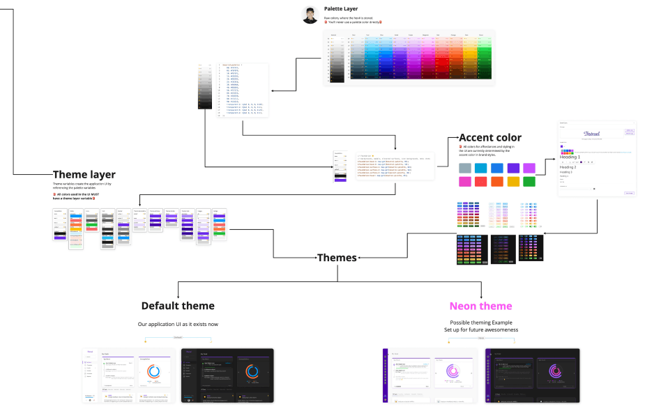
Dark mode fell out of the same architecture without a parallel system. The dark theme didn't redefine colors — it pulled inverted positions out of the same hue scale. One palette, two themes, both perceptually calibrated.
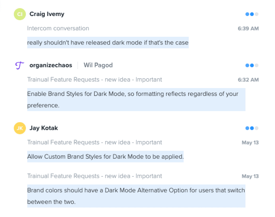
Build the data case before asking for resources
The third decision was political. Asking leadership to fund a months-long color-system rewrite as standalone infrastructure was a non-starter. Instead I collected the receipts — customer comments about contrast and dark mode from Productboard, internal engineering Slack threads about the spaghetti stylesheets, the time designers spent reverse-engineering hex values from Figma frames. When the case for resources was made, it was a case about hitting business OKRs (squad velocity, accessibility risk, dark-mode adoption), not a case about craft taste. That framing got the work approved.
Pair with engineering
The fourth decision was who built it. Matt, the squad's tech lead, became the engineering co-owner. We architected the new SCSS palette and theme map together — most of the early work happened on nights and weekends because neither of us was officially assigned to the work. The system shipped because two people, not one, were defending it through the design and code reviews where it could have quietly died.
Act 4 — Outcome
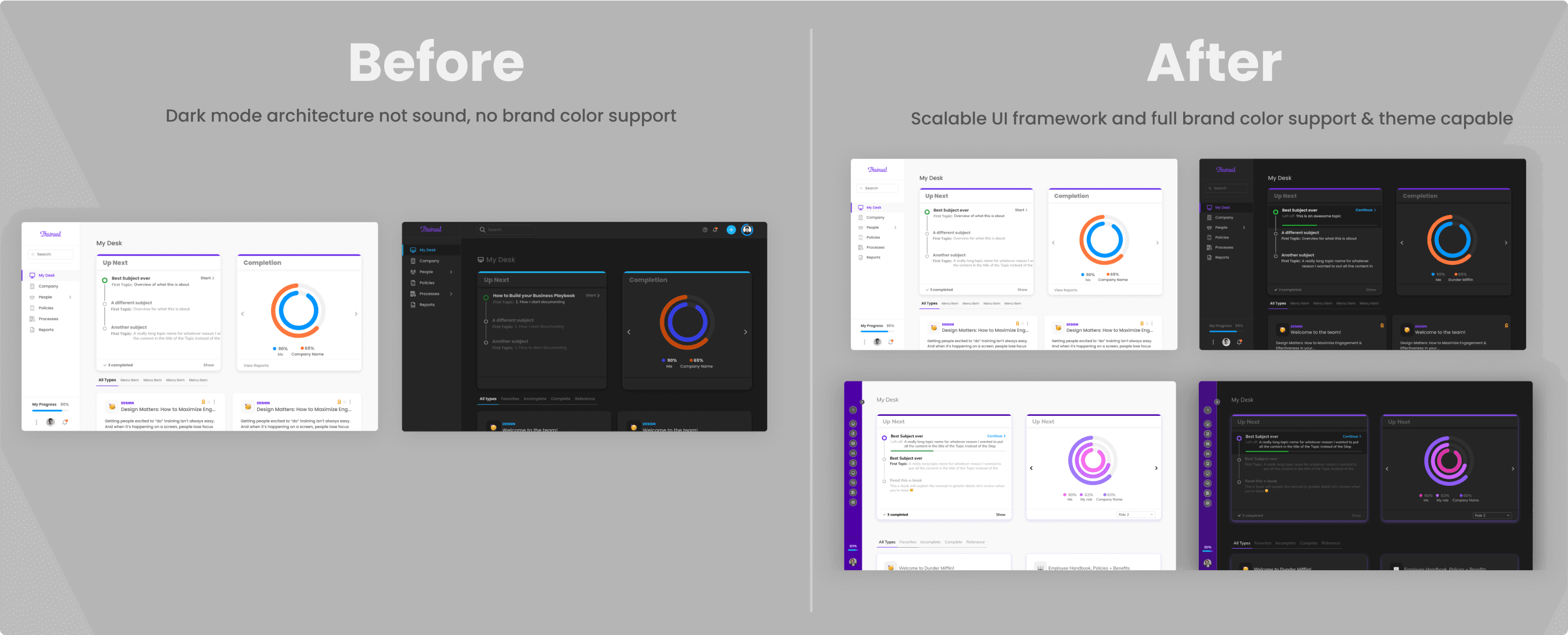
The Palette System shipped as part of My Desk 2.0 at the end of 2020, then continued to absorb the rest of the product through 2021 and into 2022. The effects the org could feel even without instrumentation:
- ~4x reduction in design iteration time on color-affected work
- Drastic reduction of styling bugs and defects across squads
- WCAG contrast compliance, even with customer-defined brand colors
- Significant reduction of stylesheet variable tech debt
- Dark mode finally documented, named, and consistent
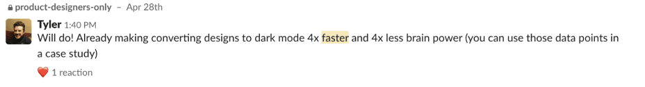
The qualitative read landed where it needed to: from the designers actually doing the work.
"Already making converting designs to dark mode 4x faster and 4x less brain power." — Tyler R., Product Designer
The architecture became the foundation of the Saguaro Design System. Every layer above it — components, documentation, contribution model — depended on the color tokens being correct in the first place.
Act 5 — Reflection
The Palette System worked because there was a technical move and a political move, and they had to land at the same time. The technical move was abandoning a flawed abstraction (percentage-based color derivation) for a sounder one (perceptual scales). The political move was abandoning a flawed framing (rewrite as infrastructure) for a sounder one (rewrite as part of an active feature initiative).
If I were redoing it, the mistake to correct would be how long Matt and I worked on weekends before securing real resourcing. The case for funded systems work has to be made early and loudly, even when the architecture isn't yet provable in code — because by the time the architecture is provable, the team has often already paid for it personally.
The lesson, which set the pattern for the rest of the Saguaro Design System the palette became the foundation for, was that color systems are not visual decisions. They're code architecture, and they survive only when engineering owns them as architecture.