My Desk 2.0
A central launchpad that gave every Trainual role a clear next action — and shipped the Palette System foundation into production along with it.
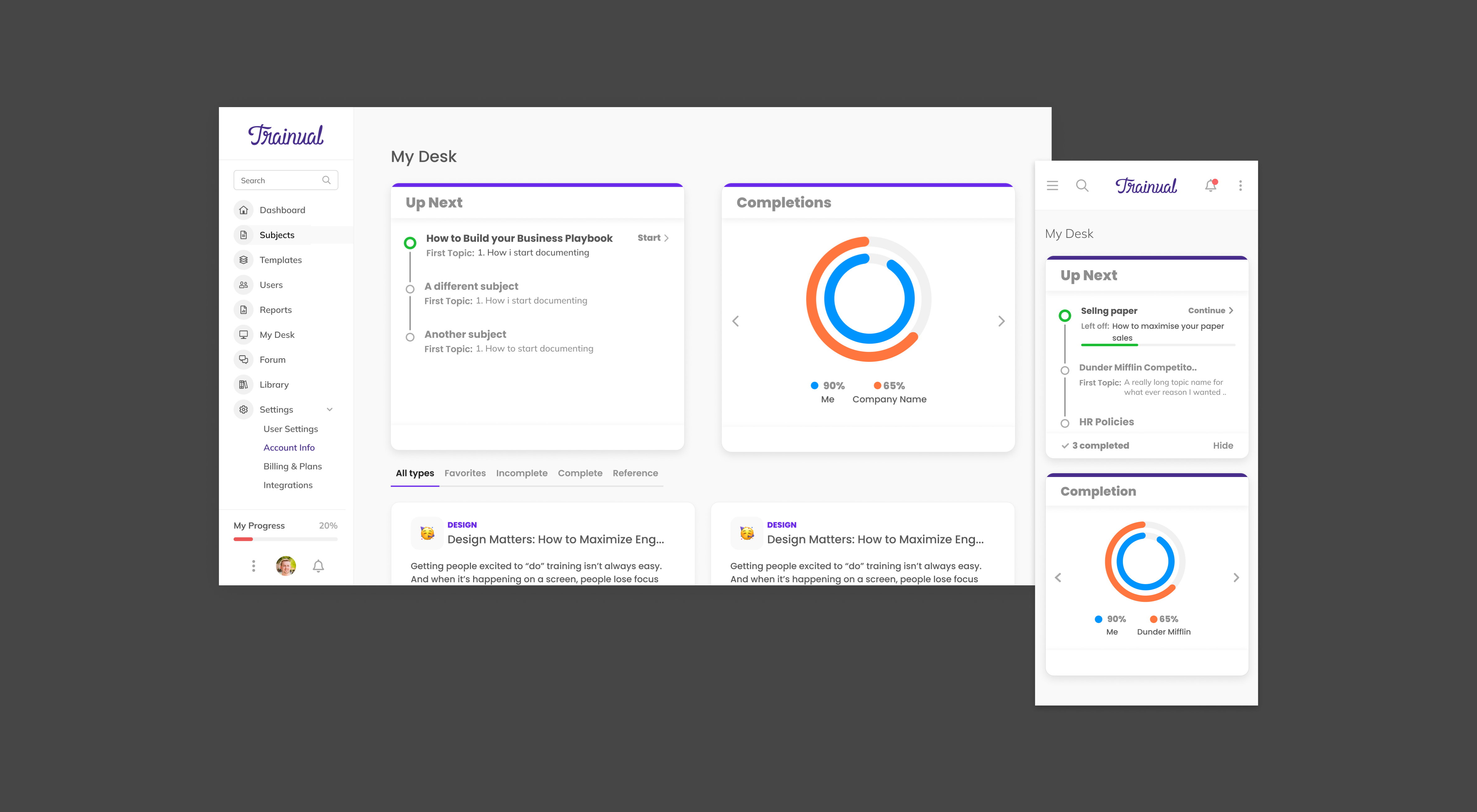
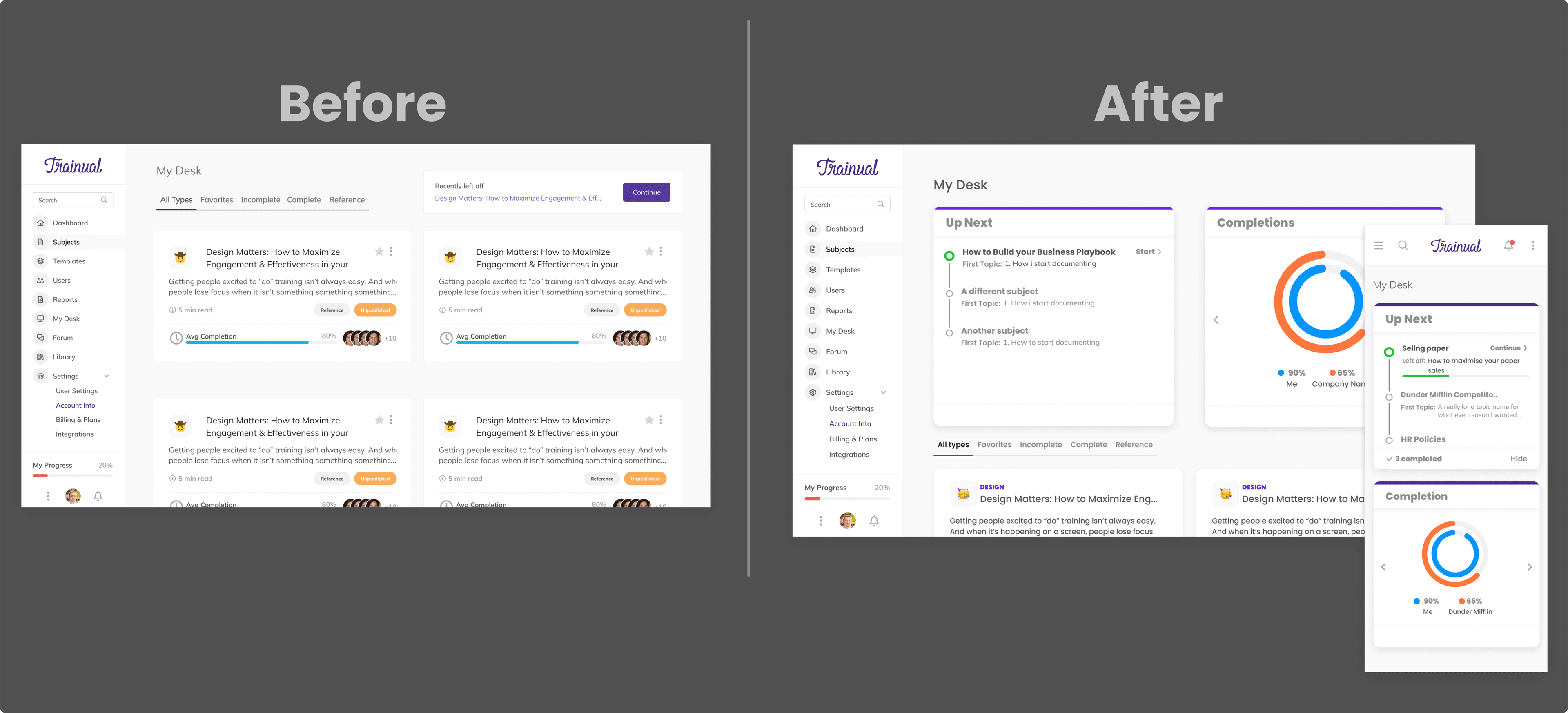
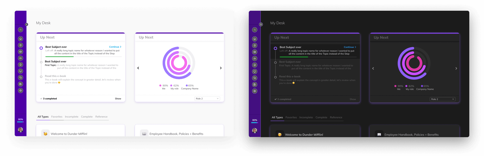
My Desk 2.0 — the home base every Trainual role landed on after sign-in. Modular widgets, the Up Next component, and the first surface to ship on the Palette System foundation.
Challenge
When someone signed into Trainual, it was unclear what to do next. The team had layered temporary patches over the gap — welcome wizards and product tours nudging customers toward content creation — but the metrics those patches were supposed to move didn't move.
The problem read differently from three different sides of the user base, and that was the point. Each role hit the same empty surface and asked a different question:
- Entrepreneurs documenting a business needed a clear action item and a sense of progress against what they'd already done — without it, the platform felt uninformative and the next session didn't come.
- Managers trying to read team performance needed visible accountability and a way to see Trainual's value showing up in their team's training — without it, the platform felt disconnected from the work they were already doing.
- Technicians needed to be trained on their business's processes but couldn't tell what to work on — without that, the platform felt like a list of nothing in particular.
Three roles, one symptom: the home surface didn't answer "what now?" The hypothesis was that a centralized launchpad with a clear, actionable path could shift the activation metric the welcome wizards weren't moving.
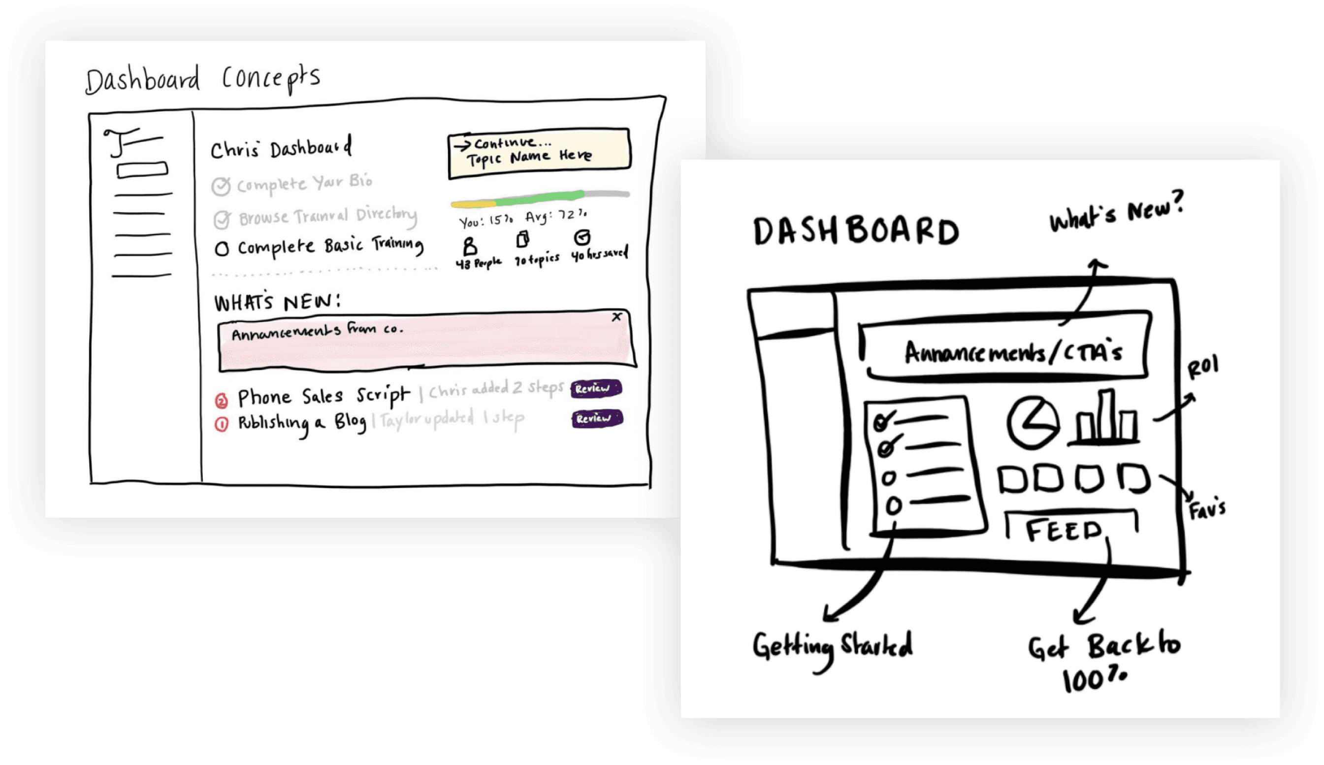
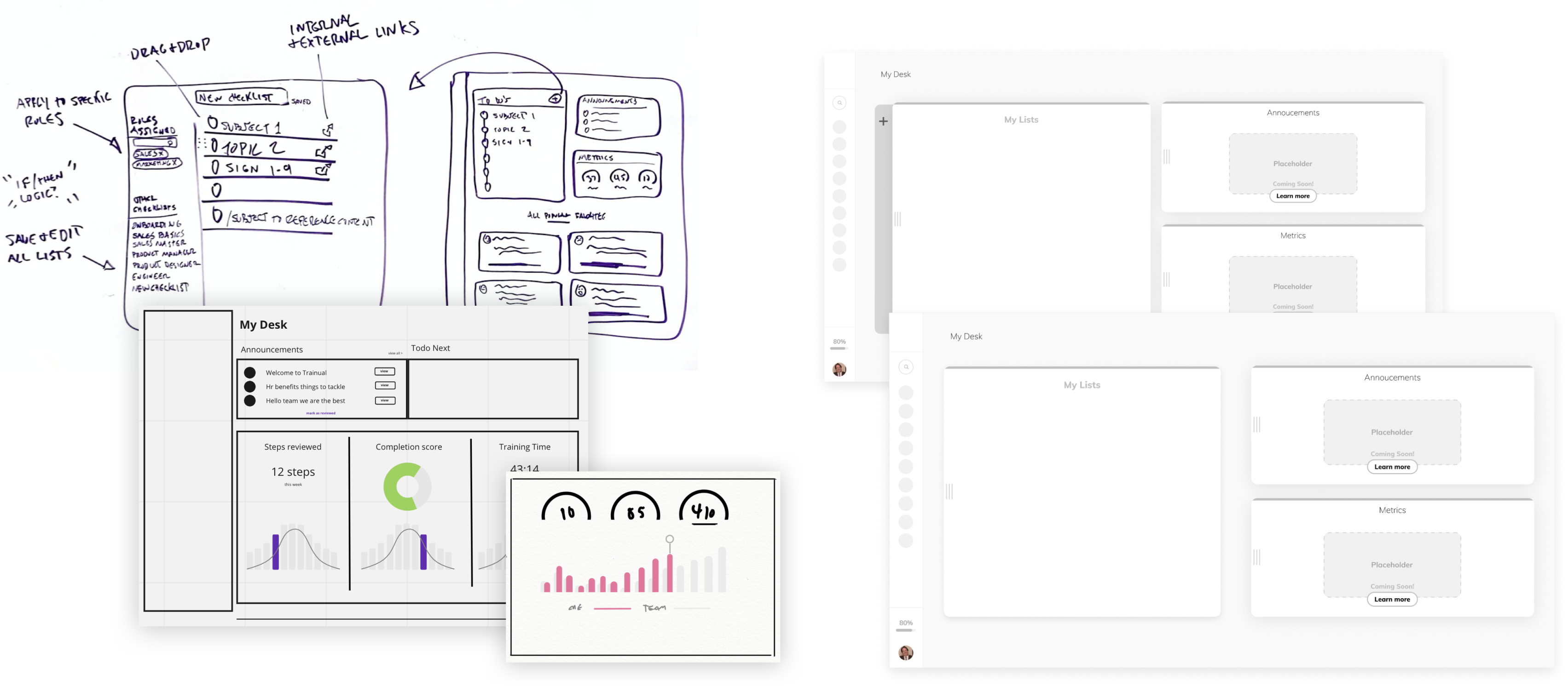
Execution
- Modular widget architecture. The page was rebuilt as a composable grid rather than a static dashboard, so the surface could carry different content for different roles and grow into the longer-term product vision instead of getting redesigned end- to-end every quarter.
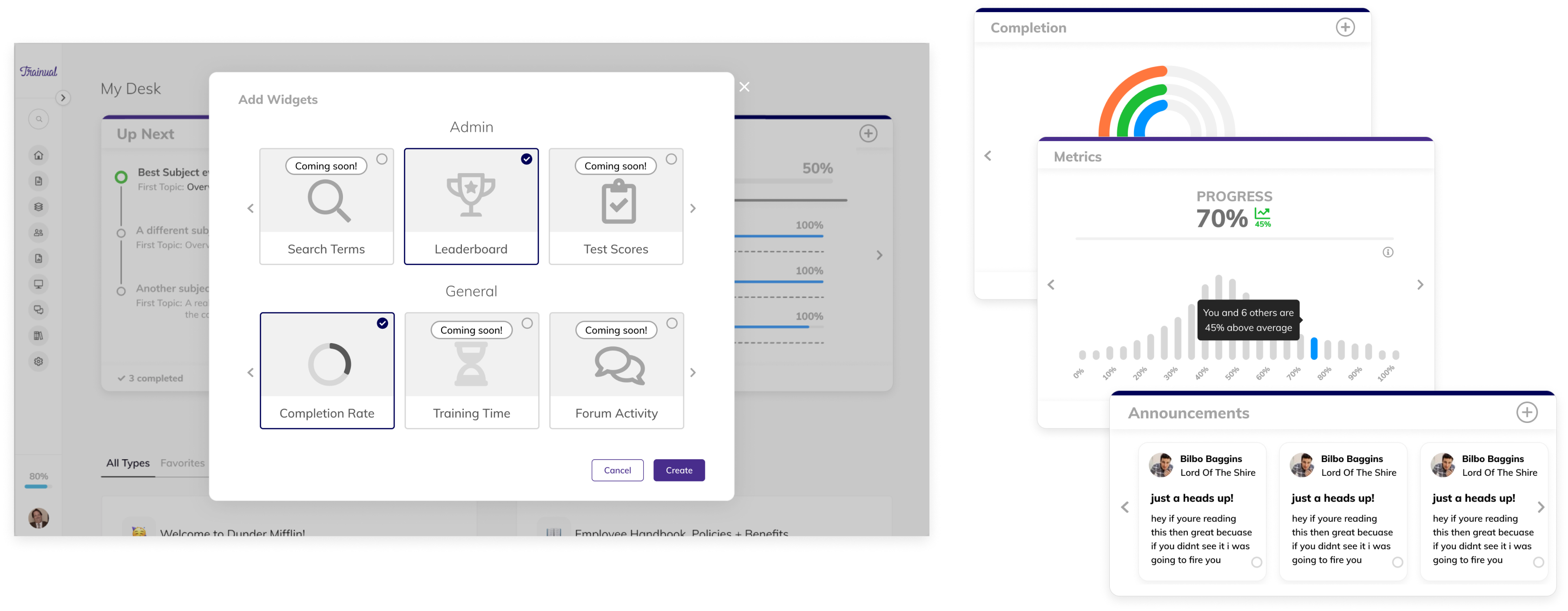
- Up Next as the activation component. The biggest pain point was "what do I work on?" Up Next collapsed that question into a single decision — here's your next thing, click it — and the metric set was built around how many people made that click and how fast they finished what came after.
- First surface on the Palette System. My Desk 2.0 was the feature initiative the Palette System shipped inside of. Routing the color rewrite through an active product initiative — instead of asking for standalone systems headcount — was what got the foundational work prioritized at all. The new page was the proof the architecture was production- ready.
- Async internal usability testing at scale. Validation ran as a large-scale internal async test rather than scheduled live sessions — appropriate to a distributed team and to a feature whose target behavior was specifically individual engagement, not guided walkthroughs.
Outcome
For customers who engaged with the Up Next component — the cohort the initiative was designed to move:
- 3× higher activity than the comparable non-Up-Next cohort.
- 20% faster step completion. The practical translation of "I know what to work on" into time saved.
- Daily feature retention above 79%. High enough that Up Next qualified as habitual rather than novelty behavior.
- Doubled feature conversion rate off the prior baseline.
Underneath those numbers, the page shipped a structural change the team carried forward. My Desk 2.0 was the first production surface built on the Palette System foundation — the same architecture the Saguaro Design System eventually composed against. The activation work and the systems work paid each other forward.
Learnings
- Subtract, don't surface. The temptation with a "home page" is to surface everything the user might want. The work was the opposite: subtract until one actionable next thing was unambiguous, then measure whether people took it.
- Feature initiatives are the right vehicle for foundation work. Asking for resourcing for a "color system rewrite" was a non- starter. Asking to ship a refreshed home page that happened to require the new color foundation got both prioritized. The Palette System case study makes the same point from the other side — My Desk 2.0 is what proved the framing worked.
- Three personas, one surface. Designing a single page that answered "what now?" for entrepreneurs, managers, and technicians forced the modular widget architecture. The same architecture is what let the page evolve afterward without another redesign.