Reporting Rebuild
Rebuilding Integrate's reporting surface around an e-commerce mental model — and giving customers (plus the in-house team that ran a server called 'The Beast' to power through it) their week back.
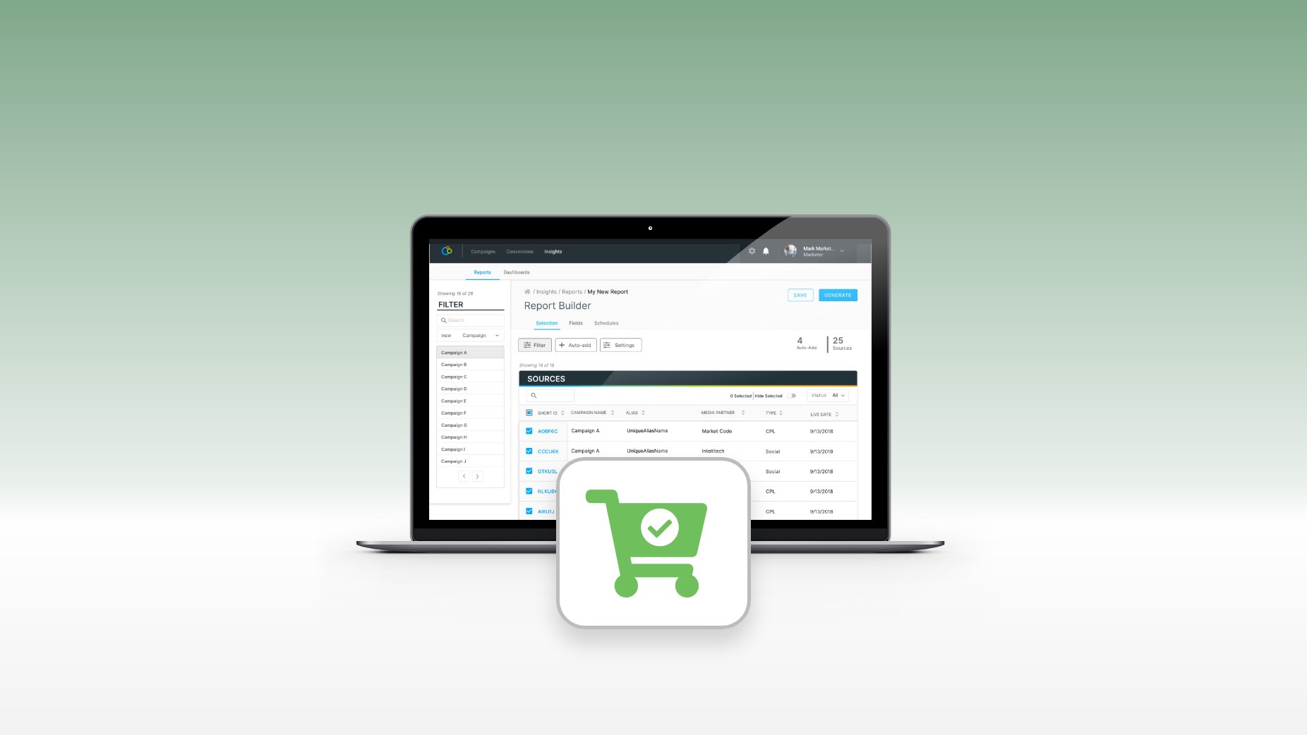
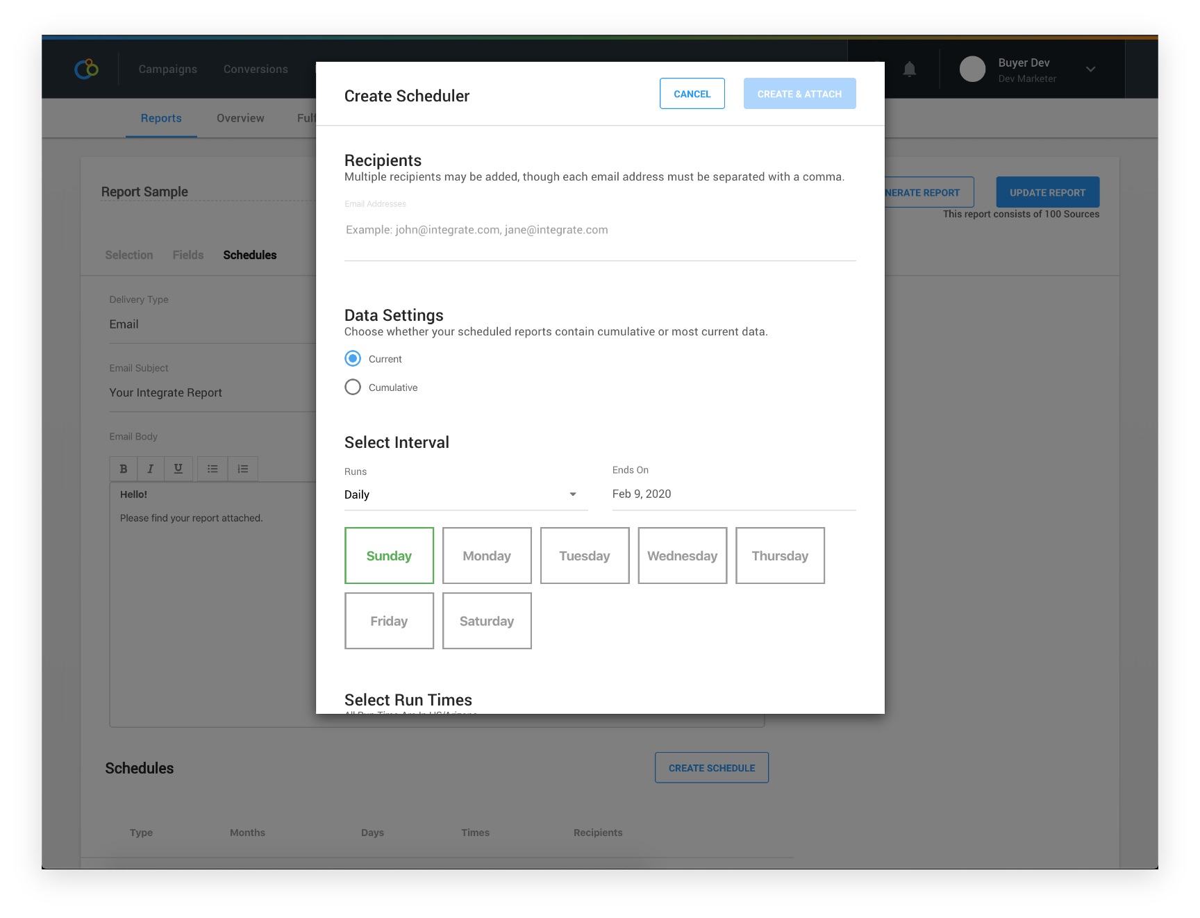
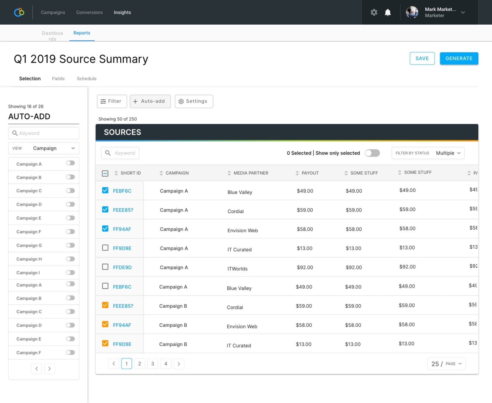
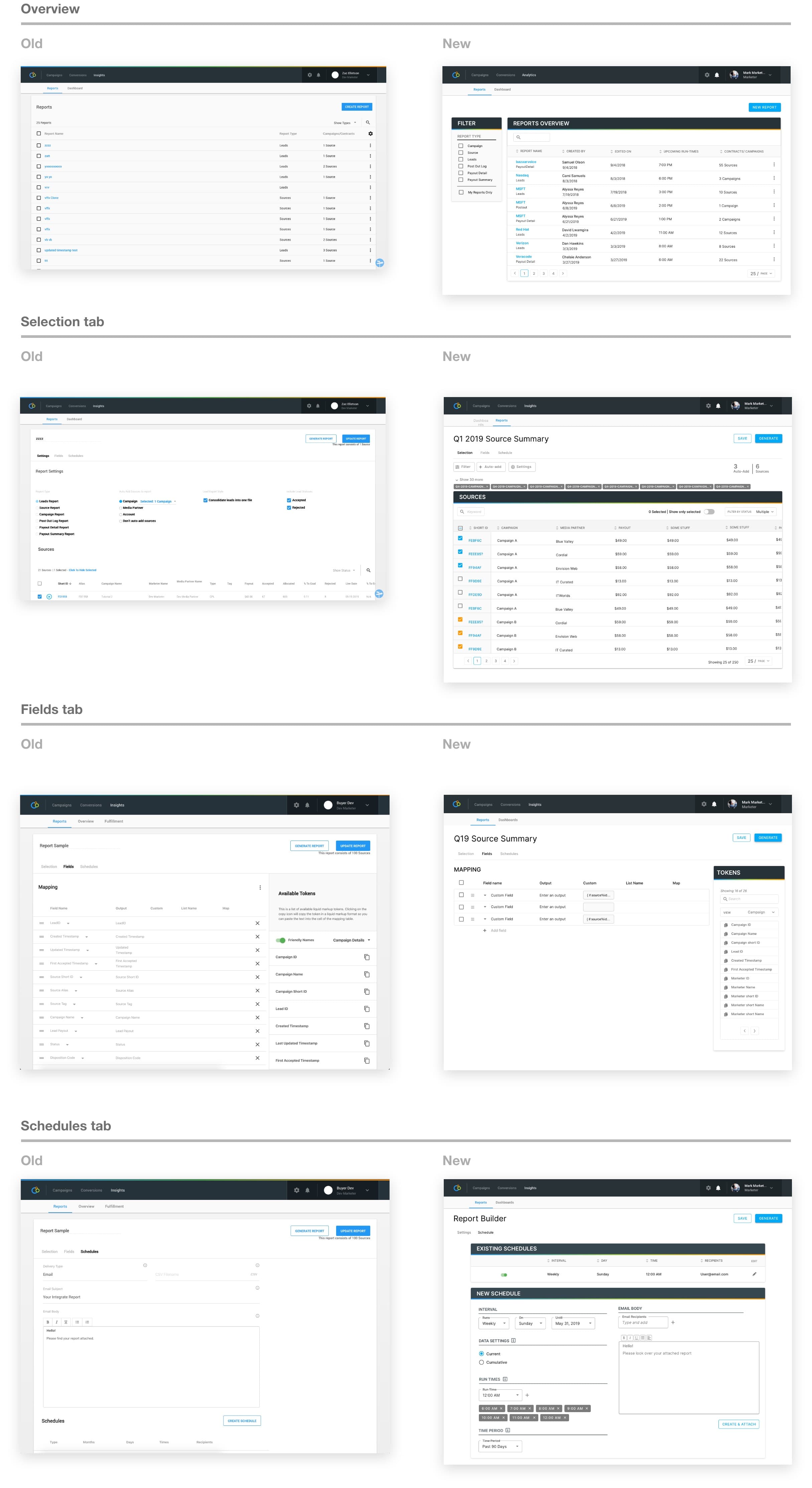
The rebuilt reporting surface — filters on the left, content on the right, an aggregated total on top. The mental model came from e-commerce; the relief it produced was business-wide.
Act 1 — The Bet
Biggest accounts were churning over Integrate's reporting feature. The work was to overhaul it end-to-end — replace the legacy report runner with a configurable surface customers could actually navigate, before patience ran out completely. The cost was that the rebuild had to ship in pieces against an active product, with no quarter to take the feature offline, and through a mid-project PM handoff.
The signal that crystallized the priority came from a customer:
"We have a machine called 'The Beast.' We brought it in specifically to run reports from Integrate." — HiP
Customers were buying hardware to outrun our software. The number wasn't abstract.
Act 2 — Constraints & Cost
The reports feature wasn't built to scale, and Integrate was scaling. The pain wasn't localized: Finance used reporting for billing and couldn't get it to perform, Managed Services ran the platform on behalf of customers and lived inside the same suffering, and Product had to look at the surface constantly for design work. Every internal function that touched it was carrying the cost.
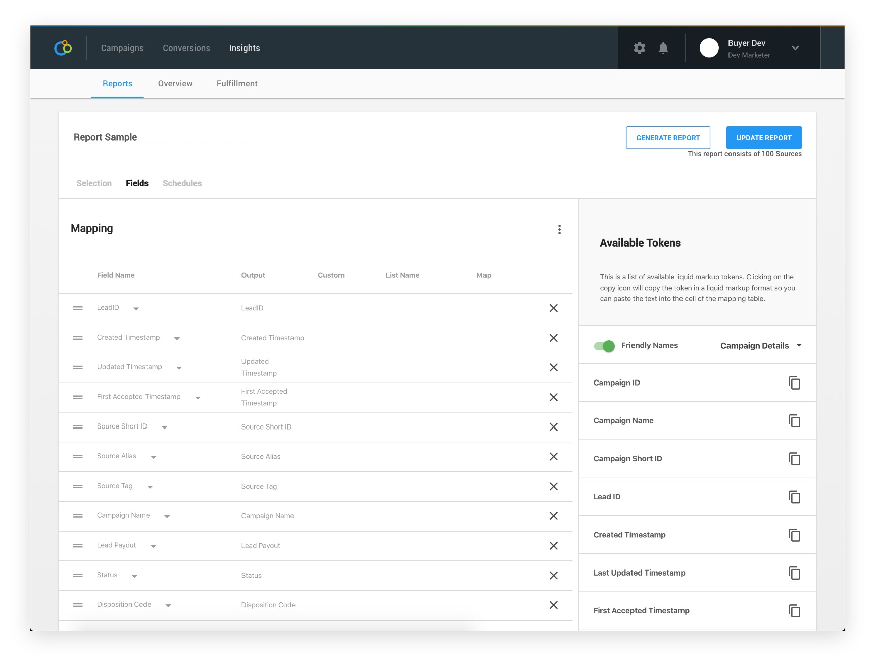
The UX failures compounded the technical ones. The Reports Settings page — where most of the actual report-building happened — had no procedural cues, an unreliable search, all the important controls below the fold, and infinite scroll where the new data lived at the bottom of the list. The most-seen state was a spinning loading logo. The Fields tab let users build custom data rules in liquid markup, but the only place to write them was a tiny text input that couldn't show a page-long string at a glance. The Schedules tab tucked its actual controls into a modal and rendered an email body where the schedule should have been.
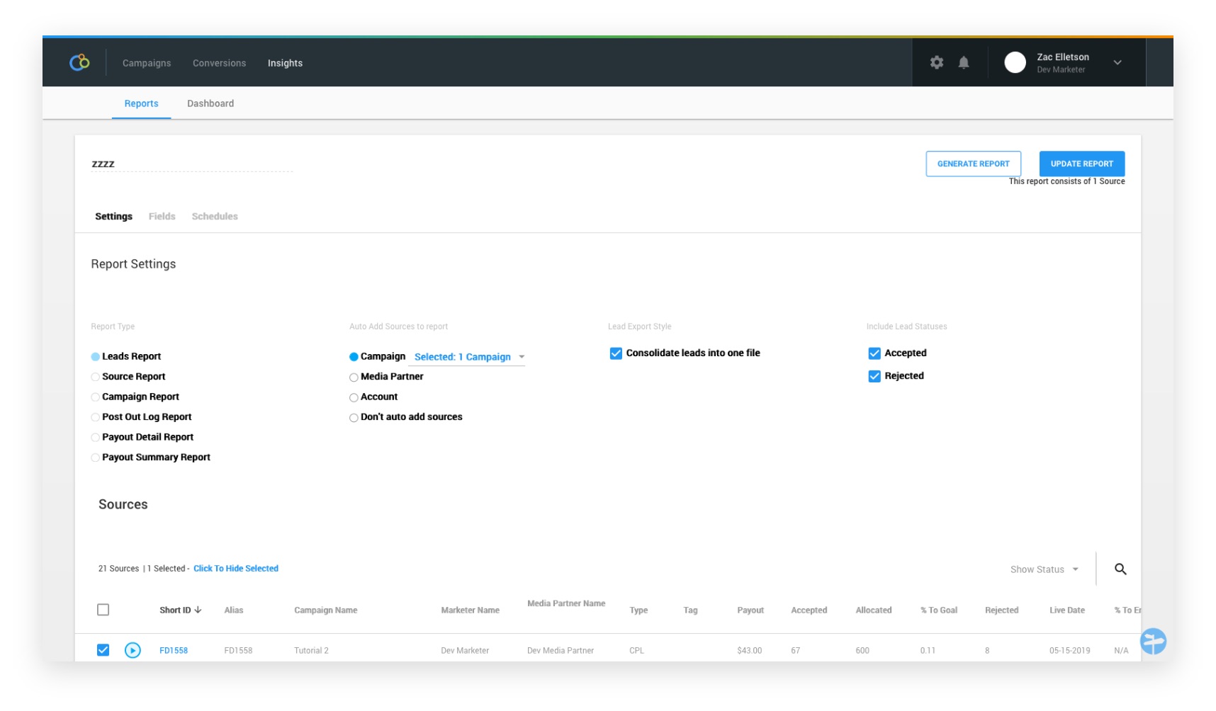
A previous rushed effort to relieve pressure had introduced a feature called Auto-add — pick a campaign, media partner, or account, and new sources would automatically attach to a report. Useful in principle, but it had shipped to satisfy a single customer, no one inside the company knew it existed, and now it had to coexist with the redesigned settings flow without making the surface more confusing than it already was.
Mid-project, my product manager left. The new PM asked the obvious question — where's the validation data? — and the honest answer was that the previous round of decisions had been made before any was collected. We re-validated the whole thing. Worth it; a lot of the original choices turned out to be wrong.
Act 3 — Decisions & Tradeoffs
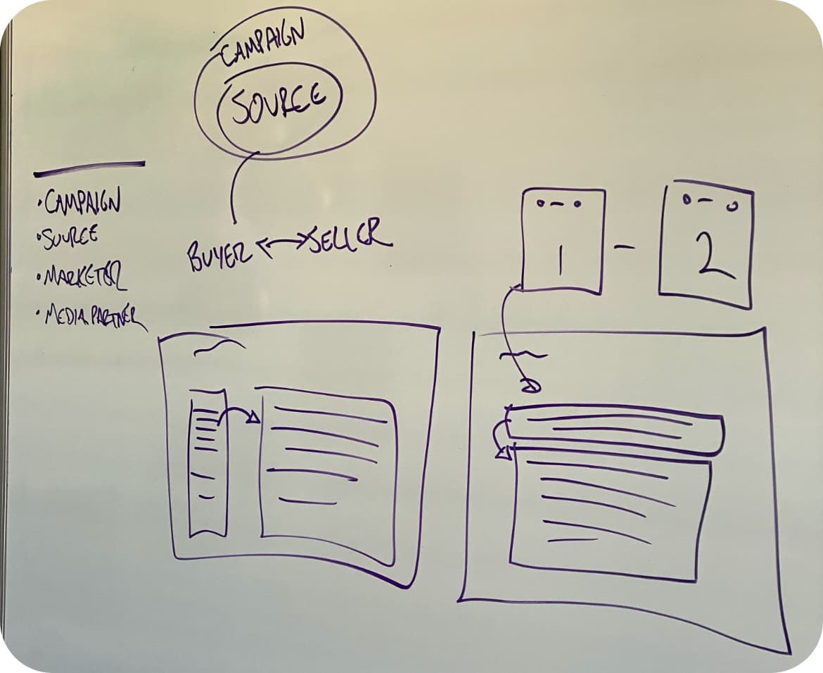
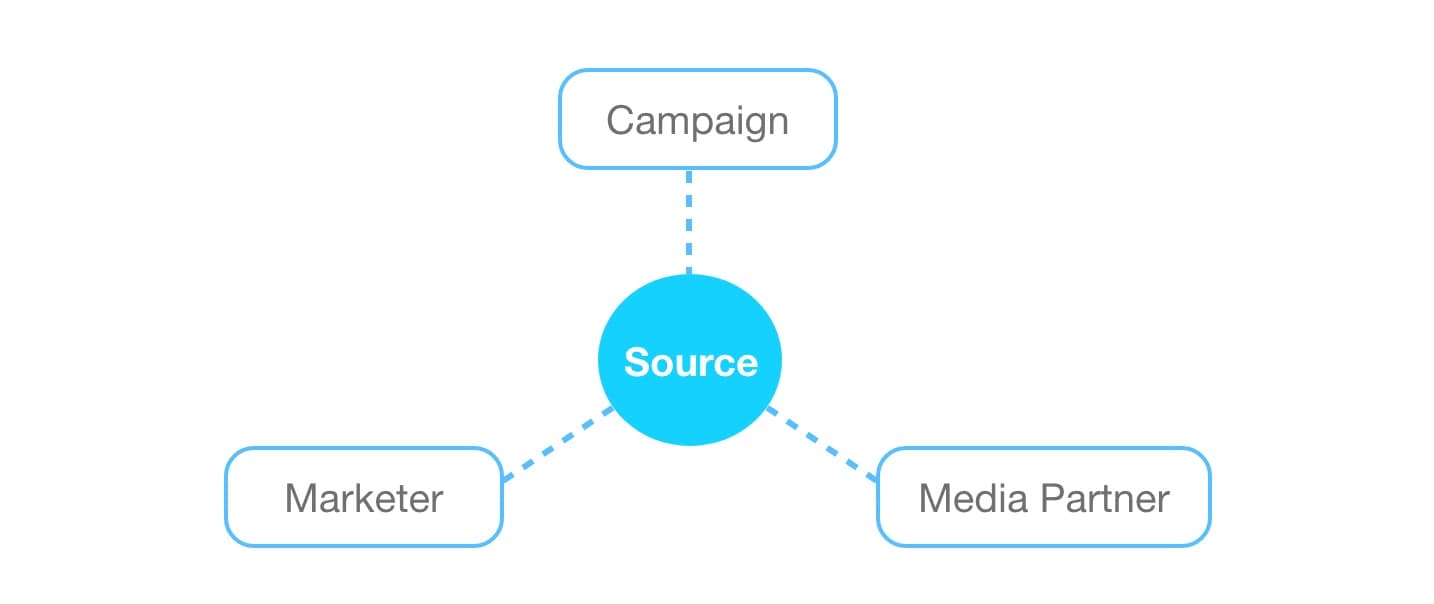
Source as the navigational pivot
Everyone on Managed Services already thought about reports in terms of three pivots: the marketer, the media partner, or the campaign. The shared concept underneath all three was the source — the partnership between a buyer (the marketer) and a seller (the media partner). The first decision was to make the source the navigational component of the new surface, with the three pivots as filter axes rather than separate views. The tradeoff was a steeper mental on-ramp for one-off users; the offset was that the people running reports daily got the model they were already using in their head.
E-commerce as the mental model
The hardest part of the rebuild wasn't the data — it was the filter UI. Filters that looked too much like the table data created confusion at a subconscious level; the gestalt cue was off, and users couldn't tell where the controls ended and the content began. The pattern was breaking the mental model the rest of the page was trying to establish.
The unlock came from looking outside B2B reporting. E-commerce had solved this exact problem at scale — massive product catalogs filtered, sorted, and selected by people who never read documentation.

The components transferred directly:
- Filters on the left, distinct in shape and weight from the content
- Content on the right, free to render however the data warranted
- Aggregated total on top so the filter state stayed legible
- An at-a-glance summary of what had been filtered out

That pattern wasn't typical in B2B SaaS at the time. The cost was arguing for it past stakeholders who didn't recognize the precedent; the offset was a navigation model every user already had in their head from buying things online.
Collapsible drawer for Auto-add — proved with an A/B test
The disagreement that took longest to resolve was about Auto-add. My PM wanted it broken into a separate flow — a modal. I argued for keeping it inside the same surface, since the function lived in the same data space as filtering. We couldn't reach agreement, so we ran an A/B test.
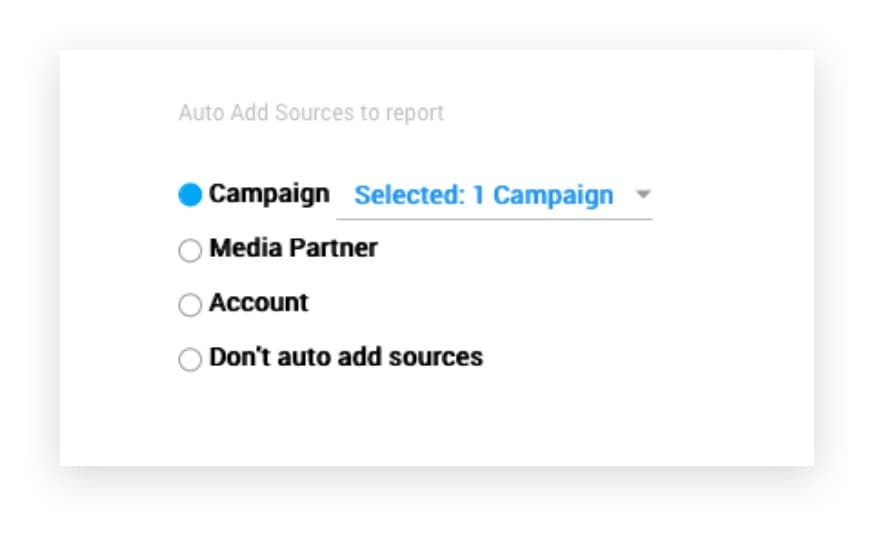
The modal lost. Users rated the interruption-of-flow as the worst part of the experience, and the modal felt out-of-place against the e-commerce pattern the rest of the page had committed to. The shipped design tucked Auto-add and filtering into a shared collapsible drawer, triggered from two distinct buttons — same pattern, separate actions, mutually exclusive use. That preserved the mental model while keeping both functions reachable.
Validate before build
The new PM's arrival reset the cadence. From that point every design decision had a usability-test result behind it before it reached development. Five recurring collaborators from Managed Services ran the same flows repeatedly against each iteration — slow at first, fast once the pattern stabilized. The cost was timeline; the offset was that nothing built had to be re-built after launch.
Act 4 — Outcome
The rebuild shipped in pieces — one tab at a time, against the live product, behind feature flags where it made sense.
- Customers got hours of their week back. Reports that had been the reason customers brought hardware in-house started running inside the platform again. The Beast anecdote stopped being a recurring joke.
- The pain stopped routing around the tool. Finance, Managed Services, and Product — the three internal functions whose work had been deformed by the legacy surface — could use reporting as designed instead of working around it.

Act 5 — Reflection
The lesson from Shopping for Data was where to look for patterns. The reporting surface didn't get solved by studying B2B reporting tools; those tools had the same problems we did. It got solved by studying e-commerce, where the underlying user problem — navigate a large set of items, filter to what matters, take action — had been solved well enough that millions of people did it daily without thinking. Pattern transfer across domains was the load- bearing move.
The other lesson was operational. The PM-handoff moment, where the new PM asked for the validation data and there wasn't any, was a small disaster I should have prevented. Decisions stored only in your own head don't survive the team change. From that project on, validation evidence went into a shared place at the time of the decision, not retroactively when someone asked for it.