Quick Embeds
Replacing the rich-content workaround in Trainual's editor with a one-step in-line picker — and watching a 90-day cohort's churn drop from 4.5% to 1.3%.
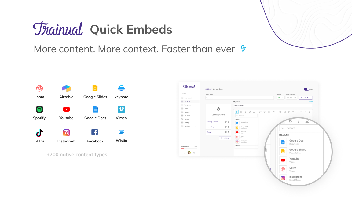
The shipped Quick Embeds surface — the in-editor picker, the provider grid, and the underlying Embedly catalog of 700+ content types.
Challenge
Content creation is the core of Trainual — the value proposition depends on customers actually documenting their business. In 2020 the editor surface lagged the market leaders on formatting and rich content. The Froala-based editor handled paragraphs and lists fine; embedded video, images, and third-party content broke or required workarounds that drove people out of flow.
Customers improvised — the kind of workarounds you'd expect when an embed mechanism is broken: bare URLs pasted where embeds were intended, media captured as screenshots, content-creation sessions abandoned mid-flow when an embed didn't land. The cost was paid in activation: new customers got far enough into a setup attempt to hit the rich-content wall, and a measurable fraction didn't come back.
The hypothesis carried the retention thesis: customers who couldn't get rich content into their accounts during the first 90 days weren't seeing enough value to stay. Quick Embeds was the MVP that tested it.
Execution
- A contextual embed picker inside Froala. Instead of a per- provider paste-and-pray flow, the new UI surfaced an in-editor picker — searchable, with a Recents row, and provider-aware — that handled embedding directly inside the editing surface. The underlying provider list ran through Embedly (Loom, YouTube, Google Docs, Slides, Vimeo, Spotify, Airtable, Figma, Wistia, and ~700 others); the Trainual-side work was the integration layer, the picker UX, and the responsive container scaffolding.
- Responsive container scaffolding. CSS that held embeds at consistent aspect ratios across the editing surface and the published view — eliminating the "looked fine while I was writing it, broke when my team read it" failure mode that produced the loudest complaints.
- Designed inside Froala's ceiling. Froala was the architectural limit on what the editor could do; the MVP shipped inside those limits on purpose. Leaning on Embedly for provider handling rather than custom-rolling each integration was how the work fit into the sprint at all.
- Cohort instrumentation before launch. Defined the success cohort up front — customers starting a paid subscription between June 1 and July 1, 2020 — so the 90-day churn read would be apples-to-apples against the 4.5% baseline rather than a moving-window argument.
Outcome
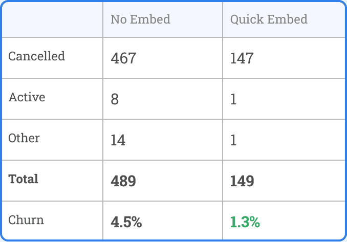
For the cohort the initiative was designed to move — customers starting a paid subscription between June 1 and July 1, 2020 — the Quick Embed group churned at 1.3% over 90 days against the 4.5% baseline.
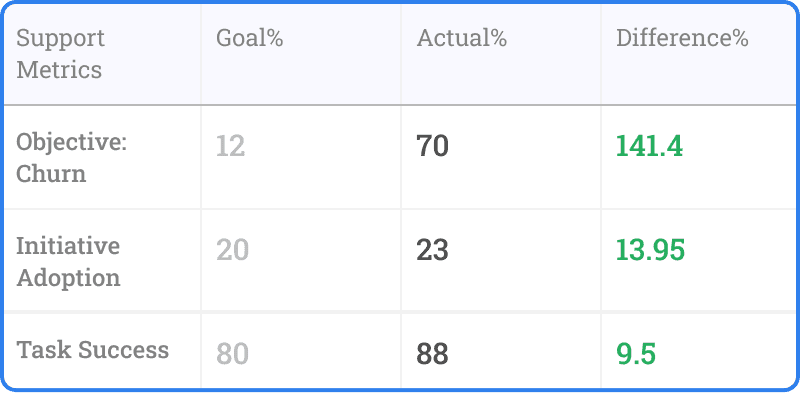
- Churn impact. A 70% relative reduction in 90-day cohort churn, against a 12% reduction target — 5.85× the planned movement.
- Feature adoption. Task success — any user who used the embed flow more than once — landed above 80%, well past the threshold for sustained behavior change.
- Strategic lift. The result reframed editor work internally: rich content wasn't a "nice to have" polish item, it was load- bearing on activation and retention. The MVP's number became the data point the team carried into the conversation about replacing the WYSIWYG library entirely.
Reactions
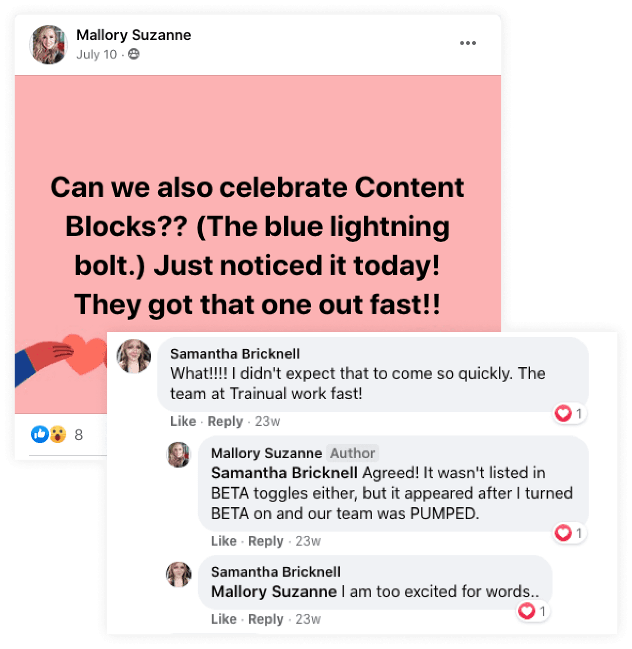
The reaction that landed loudest came from inside customer accounts — a thread on the company's customer community page about the embed icon the product team had just shipped:
"Can we also celebrate Content Blocks?? (The blue lightning bolt.) Just noticed it today! They got that one out fast!!" — Mallory Suzanne, customer
"What!!!! I didn't expect that to come so quickly. The team at Trainual work fast!" — Samantha Bricknell
"Agreed! It wasn't listed in BETA toggles either, but it appeared after I turned BETA on and our team was PUMPED." — Mallory Suzanne
Learnings
- Cohort-defined success is a sharper instrument than aggregate metrics. Pinning the win to a 30-day signup window made the result legible in a way a vague "churn went down" wouldn't have. Leadership read the number and acted on it.
- The editor's ceiling was the right place to stop. Refactoring the WYSIWYG library was the larger investment that needed to happen; this MVP shipped inside Froala on purpose. The 1.3% result was the evidence that turned the refactor argument from a craft preference into a business case.
- Workarounds are signal. Customers screenshotting media and pasting bare URLs weren't doing something weird — they were telling us, at scale, where the product's value was leaking. The MVP was, in shape, listening to the workaround and removing the friction.